Personal Wealth Management / Market Analysis
No, the US Federal Reserve's Balance Sheet Doesn't Explain Stocks' Moves
Just because two lines look alike on a chart doesn’t mean they are related.
After America’s Federal Reserve (Fed) unveiled plans last week to start letting its balance sheet shrink in May, a familiar chorus emerged in financial publications we follow: Warnings that when the Fed starts reversing its quantitative easing (QE) programme of long-term bond purchases, the US stock market will suffer. Many commentators we follow have long argued Fed bond buying—which they view as injecting money into the economy—has propped up the S&P 500. One chart that circulated widely this week even purported to show the Fed’s balance sheet and US stocks are highly correlated (meaning, tightly linked), setting stocks up to fall once monetary officials start shedding assets.[i] In our view, there are some problems with this analysis.
The chart in question seems to hinge on a long-running error, in our experience: It employs two series on separate y-axes that feature a range and scale that makes them look identical. When we make charts, we like using separate y-axes now and then when we think it provides more clarity than indexing everything to 100 and keeping it on one axis. We will also truncate y-axes to improve visibility when necessary. But we do our best to keep it clean—especially when we are trying to argue two things are closely related.
That, however, is what we think the charts that seemingly show a strong link between the Fed’s asset portfolio and the US stock market fail to do. We saw similar charts make the rounds in financial publications we follow in 2016, when the Fed was last considering running down its bond portfolio. They made the Fed’s balance sheet look identical to the S&P 500’s rise since 2008, potentially leading viewers to think stocks were likely to fall once the Fed started reducing its holdings. Exhibit 1 shows our attempt at recreating one of these charts. As you will see, we started the Fed axis at $800 billion and ended it at $5.2 trillion. That is how we were able to make it look exactly like a raw graph of the S&P 500 price index, with the two lines starting and ending in roughly the same place. If we hadn’t chopped off that $800 billion and arbitrarily selected an endpoint, it wouldn’t work.
Exhibit 1: An Example of a Skewed Chart From 2016
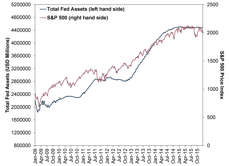
Source: FactSet, as of 13/4/2022. Total assets on the Federal Reserve System balance sheet and S&P 500 price index, weekly, 2/1/2009 – 31/12/2015. Presented in US dollars. Currency fluctuations between the dollar and pound may result in higher or lower investment returns.
Exhibit 2 shows the modern version. In this one, the lines end at around the same place. From what we can tell, getting them to align required two tactics: starting the S&P 500 axis at 750 and placing the endpoint six equal increments away—stretching it vertically to match the balance sheet, whose axis spanned 10 equal increments. In our view, this is going too far.
Exhibit 2: A More Recent—and in Our Opinion Still Skewed—Chart of the Fed and Stocks
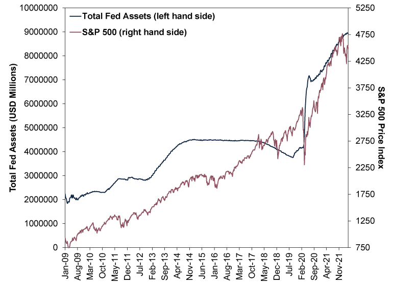
Source: FactSet, as of 13/4/2022. Total assets on the Federal Reserve System balance sheet and S&P 500 price index, weekly, 2/1/2009 – 8/4/2022. Presented in US dollars. Currency fluctuations between the dollar and pound may result in higher or lower investment returns.
Financial experts we follow have cited this chart in arguing the S&P 500 and the Fed’s balance sheet are highly correlated, meaning they move in near-lockstep. But we think that misunderstands correlation, which isn’t about whether two lines look roughly similar. Correlation refers to the frequency at which two series actually move together. That means you can’t just take the correlation between two data series levels, such as the Fed’s total balance sheet and the S&P 500 Index price level, in our view. We think correct methodology entails measuring the correlation between the changes in each over set intervals. When we measure correlations, we think using the weekly change is most accurate, as it doesn’t gloss over volatility. Conveniently, the Fed also reports its balance sheet weekly (ending on Wednesdays).
When using this methodology to measure the correlation between the Fed’s balance sheet and S&P 500 since QE began in January 2009, we get a correlation coefficient of 0.036.[ii] What does that mean? Well, a correlation of 1.00 implies two variables move in the same direction always, -1.00 implies they move in opposite directions always, and 0 implies no relationship. A correlation of 0.036 is about as close to zero as you can get.[iii] That means there is basically no relationship between changes in the Fed’s balance sheet and the S&P 500. Don’t like the weekly frequency? Even calculated monthly, the correlation is just 0.12—not statistically significant, in our view.[iv]
We don’t think this is surprising, considering the last time the Fed stopped increasing (and eventually shrank) its balance sheet, US stocks went up. Exhibit 3 shows this in what we consider to be a properly constructed way, with the Fed’s balance sheet and S&P 500 index price level indexed to 100 at 31 October 2014, the date the Fed stopped its post-financial crisis QE programme. (Indexing to 100 shows each line’s cumulative percentage change from a common starting point.) We take it through the end of 2019—after the Fed stopped running down its balance sheet in August 2019 and before COVID lockdowns caused wild swings in both stocks and the Fed’s balance sheet.[v] And we started our y-axis at 60 to give you a more zoomed-in look. As you will see, one of these lines is not like the other.
Exhibit 3: A True-to-Scale Look at Stocks and the Fed After QE
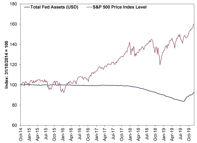
Source: FactSet, as of 13/4/2022. Total assets on the Federal Reserve System balance sheet and S&P 500 price index, weekly, 31/10/2014 – 27/12/2019. Indexed to 100 at 31/10/2014. Presented in US dollars. Currency fluctuations between the dollar and pound may result in higher or lower investment returns.
We think all the chatter about QE fundamentally errs in presuming it was stimulus and shrinking the balance sheet is so-called tightening. When the Fed purchased large quantities of long-term assets, we think it reduced long-term interest rates, which flattened the yield curve (a graphical representation of one issuer’s interest rates across the spectrum of maturities).[vi] Over 100 years’ worth of economic theory and data show flattening the yield curve means slowing economic growth.[vii] When the Fed stops reinvesting the proceeds of maturing bonds, it theoretically puts less pressure on long rates (bond prices and interest rates move in opposite directions), which allows the yield curve to steepen—which we have seen in recent months, as markets pre-emptively incorporated QE’s end and eventual reversal into share prices.[viii] That same theory and data show steeper yield curves are a big economic positive.[ix] Solid economic growth helps pad earnings growth, which we think is likely to generate a reality much better than commentators who focus on QE project. We think this was a positive force throughout the second half of the 2010s, and we think the stage looks to be set similarly now.[x]
[i] “Why the Stock Market Could be in for a ‘Rough Ride’ as Fed Prepares to Shrink Balance Sheet,” William Watts, MarketWatch, 5/4/2022.
[ii] Source: FactSet, as of 13/4/2022. Correlation between the weekly percentage change in the Federal Reserve System’s total assets and the S&P 500 price index, 2/1/2009 – 8/4/2022.
[iii] In a rhetorical sense, not a mathematic sense.
[iv] See note ii. Correlation between the monthly percentage change in the Federal Reserve System’s total assets and the S&P 500 price index, December 2008 – March 2022.
[v] Source: FactSet, as of 14/4/2022. Statement based on MSCI World Index returns with net dividends in GBP, 20/2/2020 – 13/4/2022, and “Recent Balance Sheet Trends,” Board of Governors of the Federal Reserve System, 30/7/2007 – 6/4/2022.
[vi] Source: FactSet, as of 14/4/2022. Statement based on US benchmark 3-month and 10-year government interest rates, 2/1/2009 – 8/4/2022.
[vii] Source: Global Financial Data, Inc. and US Bureau of Economic Analysis, as of 14/4/2022. Statement based on US benchmark 10-year and 3-month government interest rates and US gross domestic product—a government-produced measure of economic output. Milton Friedman and Anna Jacobson Schwartz, A Monetary History of the United States, 1867 – 1960, Princeton University Press, 1963.
[viii] Source: FactSet, as of 14/4/2022. Statement based on benchmark 3-month and 10-year government interest rates in the US, 30/4/2017 – 8/4/2022.
[ix] Source: Global Financial Data, Inc. and US Bureau of Economic Analysis, as of 14/4/2022. Statement based on US benchmark 10-year and 3-month government interest rates and US gross domestic product—a government-produced measure of economic output. Milton Friedman and Anna Jacobson Schwartz, A Monetary History of the United States, 1867 – 1960, Princeton University Press, 1963.
[x] Source: FactSet, as of 14/4/2022. Statement based on benchmark 3-month and 10-year government interest rates in the US, 30/4/2017 – 8/4/2022.
Get a weekly roundup of our market insights.
Sign up for our weekly e-mail newsletter.

You Imagine Your Future. We Help You Get There.
Are you ready to start your journey to a better financial future?

Markets Are Always Changing—What Can You Do About It?
Get tips for enhancing your strategy, advice for buying and selling and see where we think the market is headed next.
Related Resources
-
Environmental, Social and Governance Insights Responsible Investment Newsletter 20262026-03-11
-
Economics Pain at the Petrol Station Won’t Hurt the Global Economy2026-03-11
-
Market Analysis February’s Growthy Data—and the Iran War’s Souring Sentiment2026-03-06
-
Market Analysis Putting the Latest Private Credit Implosion in Perspective2026-03-06


Contact Us
Learn why 195,000 clients trust Fisher Investments and its affiliates to manage their money and find out how we may be able to help you achieve your financial goals.
As of 31/12/2025. Includes Fisher Investments and its affiliates.
New to Fisher? Call Us.
Contact Us Today