Personal Wealth Management / Market Analysis
Evaluating 'Flat Yield Curve' Fears
When measured properly, the yield curve isn’t as flat as headlines claim it is.

If you have at all glanced at financial media in recent weeks, you have likely read (or heard) the yield curve is in imminent danger of inverting, bringing recession to the US economy and havoc to stock markets. Some coverage points out that the curve is at its flattest in 11 years, with that reference point being the eve of the last bear market, which began in October 2007. Public Service Announcement: These warnings are based on a flawed version of the yield curve that doesn’t have much bearing on the real world. Moreover, they ignore the global yield curve and its increasing relevance to the world’s capital markets. When viewed in proper perspective, we don’t believe the yield curve is flashing warning signs today.
We aren’t pooh-poohing the yield curve as a leading economic indicator—indeed, it is one of the best! An inverted yield curve—with short-term interest rates higher than long-term interest rates—has preceded all US recessions since World War II, which is around the time quality national economic data begin. This isn’t just coincidence—it makes logical sense, since the yield curve drives bank lending. Banks borrow at short-term rates, either from each other or from business and household deposits. They lend at long-term rates. The spread between short and long rates is their potential profit on the next loan made. When the yield curve is steep, the spread is big and positive, and banks lend plentifully. The flatter it gets, the smaller potential profits are, and banks become more judicious when making lending decisions. They aren’t charities, after all, so if profits are small, they will likely determine there isn’t enough potential reward to make the risk of lending to less creditworthy borrowers worthwhile. At these times, as a tired joke says, you can get a loan only if you don’t need one (see: 2010, 2011, 2012). When the spread is negative and stays that way for a while, lending is a money-losing proposition, and banks curtail it. Credit locks up, capital-starved businesses can’t invest, and markets and the economy generally go kaput.
So from a philosophical standpoint, we tip our hat to all the financial commentary that is watching the yield curve like a hawk. And we concede that as they present it, things don’t look so good. The yield spread isn’t yet negative, but to the untrained eye it appears headed that way on a straight shot.
Exhibit 1: The Media’s Preferred Depiction of the Yield Curve
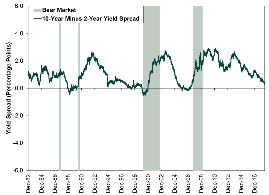
Source: FactSet, as of 7/9/2018. 10-year and 2-year Constant Maturity Treasury Yields, 12/31/1982 – 7/9/2018.
There are just two problems with this. One, line graphs aren’t self-fulfilling prophecies. Two, this is the wrong yield curve! It uses the 2-year Treasury yield as the short-term rate. This is the spread every financial media outlet has been citing for months now. It is also a very strange thing to cite. Banks don’t do much borrowing at 2-year rates. About the only way they would do so is by selling a 2-year CD. A tally of all outstanding 2-year CDs unfortunately isn’t available, but the amount of all time deposits outstanding is a little less than $2.1 trillion—this would include all CDs, some shorter than 2-years, some longer.[i] But there are over $12 trillion in total US bank deposits, leaving over $10 trillion in plain old checking or savings accounts, which yield close to the overnight rate, represented by the effective fed-funds rate.[ii] Further, another primary historical source of bank funding is bank-to-bank overnight funding—when one bank lends excess funds to another. Because both of these are so short term, we believe it is more accurate to measure loan profitability using the effective fed-funds rate or 3-month rate (which is very similar) as the yield spread’s short rate. Exhibit 2 shows this yield curve spread, and it is far less scary-looking than Exhibit 1.
Exhibit 2: Our Preferred Depiction of the Yield Curve
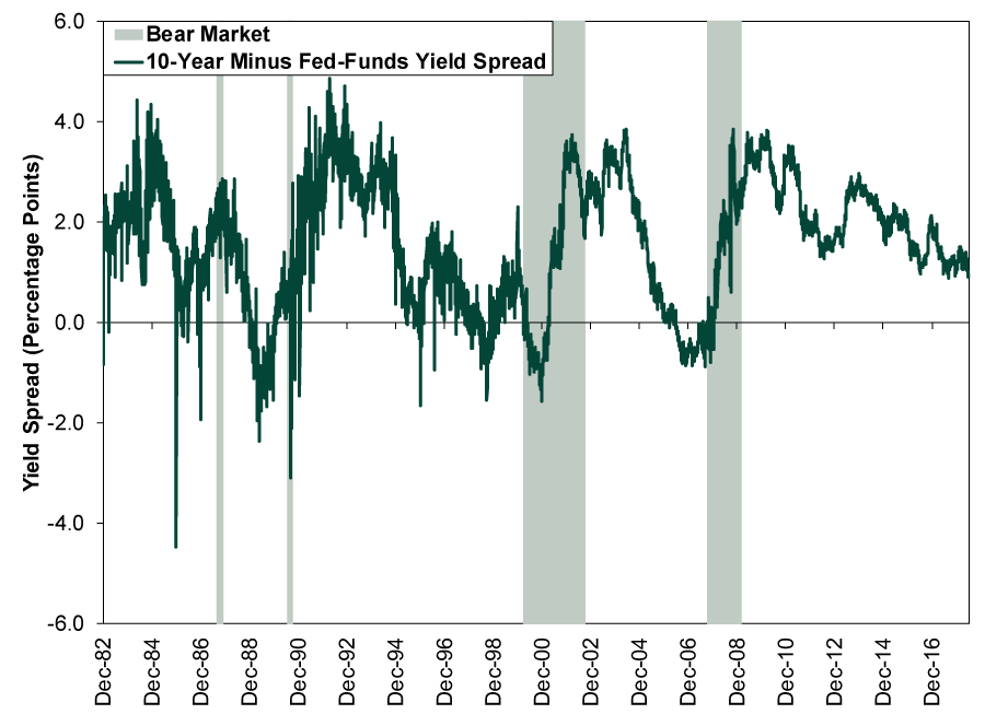
Source: FactSet, as of 7/9/2018. 10-Year Constant Maturity Treasury Yield and Effective Fed-Funds Rate, 12/31/1982 – 7/9/2018.
And to really drive the point home, here are both of them together.
Exhibit 3: Dueling Yield Spreads
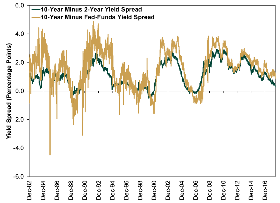
Source: FactSet, as of 7/9/2018. 10-Year and 2-Year Constant Maturity Treasury Yields and Effective Fed-Funds Rate, 12/31/1982 – 7/9/2018. We left the bear market shading off this one because it was getting pretty crowded.
Or, forget the messy chart and consider the numbers. The 2-year/10-year spread is only 0.29 percentage point as of Monday’s close. The fed-funds/10-year spread is more than three times as wide, 0.95 percentage point. That may be near the flattest of this expansion, but the spread was a lot flatter throughout 2005 and for much of the magical late-1990s. You might also notice this yield curve was inverted from June 2006 onward during the last bull market, over a year before the bear began. There is simply nothing negative to glean today from a market-timing standpoint.
Moreover, we live in the future now, with modern, computerized, global capital markets. One reason 2006’s inverted yield curve didn’t cause an immediate credit crunch and recession is because the US isn’t an island, either literally or metaphorically. Most of the world’s main lenders are big, multinational banks with global footprints. They can easily borrow from Country A, shift the funds to Country B, hedge for currency risk and lend in Country B. It takes a few keystrokes. When America’s yield curve inverted after the Fed jacked up short rates at 17 straight meetings, banks were able to borrow elsewhere at cheaper rates and lend in the U-S-of-A for a tidy enough profit. Therefore, when considering the yield curve, we think it is most helpful to look at the global yield curve—a mashup of MSCI World constituent countries’ yield curves, with each weighted according to its share of GDP. Due to data availability, we construct the global curve using 3-month rates instead of overnight, but the difference between the two is minimal. At last count, the global yield spread was 0.9 percentage point, only modestly slimmer than it was a year ago (1.3 percentage point)—and even that year-ago increase was a quick blip.[iii] Considering global economic growth—and US growth—were quite swift over the last year, we daresay today’s global yield spread should be a-ok.
Not to go all Pollyanna on you, but we think it is important to consider the implications for investor sentiment. False fears are typically bullish, because they create room for uncertainty to fall and reality to bring the positive surprises that often boost stocks. The widespread obsession with the supposedly inverting but wrong yield curve has hit sentiment pretty hard, ratcheting up nervousness about the US economy. As more investors notice America’s healthy (and improving) loan growth flying in the face of these false fears, we suspect stocks should get a boost from the corresponding relief.[i] Source: St. Louis Federal Reserve, as of 7/9/2018.
[ii] Source: Federal Reserve, as of 7/9/2018.
[iii] Source: FactSet, as of 6/25/2018.
If you would like to contact the editors responsible for this article, please message MarketMinder directly.
*The content contained in this article represents only the opinions and viewpoints of the Fisher Investments editorial staff.
Get a weekly roundup of our market insights
Sign up for our weekly e-mail newsletter.

You Imagine Your Future. We Help You Get There.
Are you ready to start your journey to a better financial future?
Where Might the Market Go Next?
Confidently tackle the market’s ups and downs with independent research and analysis that tells you where we think stocks are headed—and why.
Related Resources
-
Politics Blunting Burnham?2026-07-21
-
Market Analysis Why the SOX “Bear Market” Isn’t Foreboding2026-07-21
-
Expert Commentary 3 Things You Need to Know This Week | Q2 Earnings, ECB Meeting, Trump Accounts
 2026-07-20
 -
Weekly Wrap-Up Fisher Investments Reviews: Last Week in Markets—July 13 - July 172026-07-20


Learn More
Learn why 210,000 clients trust us to manage their money and how Fisher Investments and its affiliates may be able to help you achieve your financial goals.
As of 6/30/2026
New to Fisher? Call Us.
Contact Us Today