Personal Wealth Management / Market Analysis
No, the Fed’s Balance Sheet Doesn’t Explain Stocks’ Moves
Just because two lines look alike on a chart doesn’t mean they are related.

Every now and then, a chart goes viral and freaks people out. In early 2014, it was a graph that used manipulated y-axes to make the Dow Jones Industrial Average’s path since July 2012 look identical to the run-up to 1929’s crash—with look out below being the general implication. In early 2016, folks tortured data to make the Fed’s balance sheet look identical to the S&P 500’s rise since 2008, implying tough times once the Fed started shrinking its portfolio. Now they are at it again! Last week, Fed meeting minutes revealed plans to start letting the balance sheet shrink at a fast clip in May. Queue another fast-circulating chart claiming the Fed’s balance sheet and stocks are highly correlated, setting stocks up to fall once the Fed starts shedding assets. Please let us dismantle this.
Today, as in 2014 and 2016, the viral chart seems to hinge on a long-running error: It employs two series on separate y-axes that feature a range and scale that makes them look identical. We like using separate y-axes now and then when we think it provides more clarity than indexing everything to 100 and keeping it on one axis. We will also truncate y-axes to improve visibility when necessary. But we do our best to keep it clean—especially when we are trying to argue two things are closely related.
That, however, is what the offending charts fail to do. Exhibit 1 shows our recreation of 2016’s version. As you will see, we started the Fed axis at $800 billion and ended it at $5.2 trillion. That is how we were able to make it look exactly like a raw graph of the S&P 500 price index, with the two lines starting and ending in roughly the same place. If we hadn’t chopped off that $800 billion and arbitrarily selected an endpoint, it wouldn’t work.
Exhibit 1: An Example of a Skewed Chart From 2016
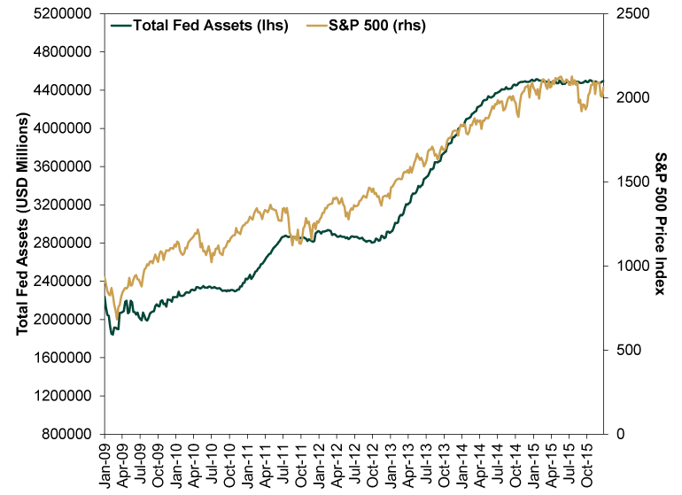
Source: FactSet and mischief, as of 4/13/2022. Total assets on the Federal Reserve System balance sheet and S&P 500 price index, weekly, 1/2/2009 – 12/31/2015.
Exhibit 2 shows the modern version. In this one, the main goal appears to be getting the lines to end at around the same place. That required two tricks: starting the S&P 500 axis at 750 and placing the endpoint six equal increments away—stretching it vertically to match the balance sheet, whose axis spanned 10 equal increments. At least it wasn’t tortured further to get the lines to start in the same place, but it still violates some cardinal rules, in our opinion.
Exhibit 2: A Tortured Chart of Stocks and the Fed’s Balance Sheet
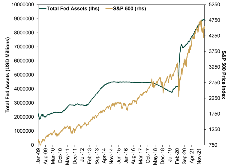
Source: FactSet and tricks, as of 4/13/2022. Total assets on the Federal Reserve System balance sheet and S&P 500 price index, weekly, 1/2/2009 – 4/8/2022.
Pundits across the Internet have used this chart to argue the S&P 500 and the Fed’s balance sheet are highly correlated. But that misunderstands correlation, which isn’t about whether two lines look roughly similar. Correlation refers to the frequency at which two series actually move together. That means you can’t just take the correlation between two data series levels, such as the Fed’s total balance sheet and the S&P 500 Index price level. You have to measure the correlation between the changes in each over set intervals. When we measure correlations, we think using the weekly change is most accurate, as it doesn’t gloss over volatility. Conveniently, the Fed also reports its balance sheet weekly (ending on Wednesdays).
When using this methodology to measure the correlation between the Fed’s balance sheet and S&P 500 since quantitative easing began in January 2009, we get a correlation coefficient of 0.036.[i] What does that mean? Well, a correlation of 1.00 implies two variables move in lockstep, -1.00 implies they move in opposite directions always, and 0 implies no relationship. A correlation of 0.036 is about as close to zero as you can get.[ii] That means there is basically no relationship between changes in the Fed’s balance sheet and the S&P 500. Don’t like the weekly frequency? Even calculated monthly, the correlation is just 0.12—not statistically significant.[iii]
Which shouldn’t surprise, considering the last time the Fed stopped increasing (and eventually shrank) its balance sheet, stocks went up. Exhibit 3 shows this in a properly constructed way, with the Fed’s balance sheet and S&P 500 index price level indexed to 100 at October 13, 2014, which is when the Fed stopped its post-financial crisis quantitative easing (QE) program. We take it through the end of 2019—after the Fed stopped running down its balance sheet in August 2019 and before COVID lockdowns caused wild swings in both stocks and the Fed’s balance sheet. And we started our y-axis at 60 to give you a more zoomed-in look. As you will see, one of these lines is not like the other.
Exhibit 3: A True-to-Scale Look at Stocks and the Fed After QE
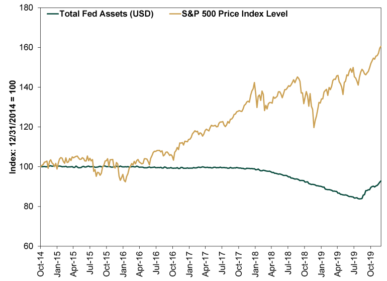
Source: FactSet and high standards, as of 4/13/2022. Total assets on the Federal Reserve System balance sheet and S&P 500 price index, weekly, 10/31/2014 – 12/27/2019. Indexed to 100 at 12/31/2014.
If you would like a detailed explanation of our thoughts on the “why” behind Exhibit 3, we invite you to revisit last week’s article on the Fed’s meeting minutes. But in short, we think all the chatter about QE fundamentally errs in presuming it was stimulus and shrinking the balance sheet is “tightening.” QE lowered long rates, which flattened the yield curve. Over 100 years’ worth of economic theory and data show flattening the yield curve means slowing economic growth. When the Fed stops reinvesting the proceeds of maturing bonds, it puts less pressure on long rates, which allows the yield curve to steepen—which we have seen in recent months, as markets priced in QE’s end and eventual reversal. That same theory and data show steeper yield curves are a big economic positive. Solid economic growth helps pad earnings growth, creating a reality much better than the QE-obsessed world expects. That was a positive force throughout the second half of the 2010s, and we think the stage looks to be set similarly now.
[i] Source: FactSet, as of 4/13/2022. Correlation between the weekly percentage change in the Federal Reserve System’s total assets and the S&P 500 price index, 1/2/2009 – 4/8/2022.
[ii] In a rhetorical sense, not a mathematic sense.
[iii] See note i. Correlation between the monthly percentage change in the Federal Reserve System’s total assets and the S&P 500 price index, December 2008 – March 2022.
If you would like to contact the editors responsible for this article, please message MarketMinder directly.
*The content contained in this article represents only the opinions and viewpoints of the Fisher Investments editorial staff.
Get a weekly roundup of our market insights
Sign up for our weekly e-mail newsletter.

You Imagine Your Future. We Help You Get There.
Are you ready to start your journey to a better financial future?
Where Might the Market Go Next?
Confidently tackle the market’s ups and downs with independent research and analysis that tells you where we think stocks are headed—and why.
Related Resources
-
Expert Commentary This Week in Review | Global PMIs, SpaceX, RMD Planning
 2026-07-10
 -
Market Analysis Trim Your Angst on Economic Measurement Tweaks2026-07-09
-
Politics Long-Term Forecasts and Court Verdicts: The Latest in British and French Politics2026-07-09
-
Corporate Information How You Benefit from Fisher Investments' Transparent Fee Structure
 2026-07-08


Learn More
Learn why 210,000 clients trust us to manage their money and how Fisher Investments and its affiliates may be able to help you achieve your financial goals.
As of 6/30/2026
New to Fisher? Call Us.
Contact Us Today