Personal Wealth Management / Market Analysis
More on the Myth of the All-Powerful Fed
Don’t overstate the Fed’s influence over the economy and markets.

After the FOMC adjourned its March meeting, financial media immediately drew conclusions about US monetary policy’s direction for the rest of the year, cheering the prospect of zero rate hikes—with some even speculating about a rate cut. When the yield curve inverted slightly on Friday morning, we suspect the prospect of a Fed rate cut became even more attractive to some. Mind you, we don’t think it is necessary or that this inversion is anything to lose sleep over. A surprise inversion that no one paid attention to would potentially be a negative, as it could signal euphoric investors were ignoring the risk of a weakening economy—that is what happened in March 2000, when the 1990s bull ended. Today, however, we have the opposite: Everyone fearing slow growth and all eyeballs from here to kingdom come watching the slight inversion and tying themselves in knots over it. Its surprise power is sapped, and abundant fear merely extends the bull market’s wall of worry. Stocks should keep climbing that wall, helped in part by the widely ignored—but nicely positive—global yield curve.
Still, because the Fed is on everyone’s mind, let us explore the history of Fed rate cuts and whether investors should put much stock in the legend of the “Fed put.” Investors’ new short-term interest rate expectations stem from the FOMC’s updated economic projections, including the widely watched “dot plot”—which shows 17 officials’ forecasts of the fed-funds target rate over the next three years “and beyond.” In December 2018, the median forecast was two 2019 rate hikes. Now, the median is for none. This isn’t terribly shocking, given the odd optics associated with tightening into widespread economic slowdown fears. However, it also isn’t a blueprint. Nevertheless, fed-funds futures markets imply investors see a better than 50% chance of rate cuts by yearend—up significantly from Monday.
Four years ago this week, MarketMinder’s Senior Editor Elisabeth Dellinger wrote about why folks shouldn’t put too much stock in the dot plot in her column, “Fed People Write Words, Draw Dots”—and those lessons still hold true today. As March 2015’s dot plot showed, the vast majority of Fed folks thought fed funds would be above 2.5% starting in 2017 and at least at 3% in the “longer run.” Yet here we are in “the longer run” of March 2019, and the fed-funds target range was just set to 2.25% — 2.50% in December 2018. In our view, this is a keen reminder the Fed doesn’t possess a crystal ball that allows them to see years into the future.
Some view a cut as blessing markets with a mythical “Powell put,” also known more generally today as the “Fed put.” This is a nod to the “Greenspan put,” which gained prominence in the 1990s under Fed Chair Alan Greenspan. The original Greenspan put refers to the idea that the Fed will step in with supportive monetary policy—specifically, by cutting rates—when financial markets are in trouble. It derived its name from a “put option,” a type of financial derivative contract typically used as a form of insurance or hedge against declining stock prices.
As Exhibit 1 shows, while most rate cuts come after recessions or bear markets have begun and the Fed sees a need for stimulus, there is some precedent for the Fed to cut rates during a bull market as well. Widely cited examples of the Greenspan put include Greenspan’s rate cuts in the second half of 1998, ostensibly because of the Russian ruble crisis, as well as in the mid-1990s.
Exhibit 1: US Overnight Rates, 1980 – 2019
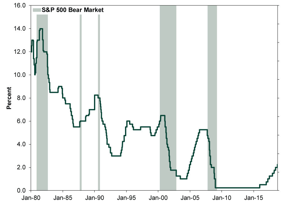
Source: Global Financial Data, FactSet and Fisher Investments Research, as of 3/20/2019. Fed discount rate switches to Fed funds target rate starting on 1/1/1990. In December 2008, the FOMC replaced the Fed funds target rate with a target range.
Will the Fed cut? Who knows. We reckon policymakers have bandwidth to do so, considering inflation is presently below their 2% y/y target and has decelerated lately. It would also be a logical move, if the yield curve stays inverted, and given the heaps of media attention on the inversion, it would be sort of weird—and potentially credibility-damaging—for the FOMC to sit tight if inversion lingers when next it meets. There is also precedent. The well-known 1998 “Greenspan put” occurred in a bull market amid a volatile time. That year featured a big correction with plenty of scary stories, from the Asian financial crisis and Russian ruble crisis to the failure of a big hedge fund and Y2K worries. Thus, the Fed cutting rates from September – November that year looks like a cut-and-dry example of the “Greenspan put” working.
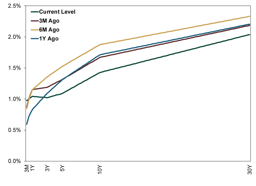
That said, whether they will or not is anyone’s guess. After all, this is an organization that just decided to add to long-term Treasury holdings amid a flattening (and slightly inverting) yield curve. However, we don’t think Fed action is necessary for the bull market to continue. One, with all the media attention, this slight inversion is almost surely priced in—the negative surprise power is gone, and expectations are primed for positive surprise. Two, long rates could tick back up, un-inverting the curve. Three, even if they don’t, inversion isn’t a timing tool, as Exhibits 2 and 3 show. Four, a slightly inverted yield curve is barely distinguishable from the flattish curve America had for months. In a globalized world like this, one country’s yield curve matters little—even a country as large as the US. Big American banks can pretty easily borrow for next to nothing throughout the eurozone, Sweden and Japan, hedge for currency risk, and make a tidy profit lending those funds here. Easy arbitrage in global financial markets is why the global yield curve is what matters. As Exhibit 4 shows, it is nicely positive.
Exhibit 2: Inverted Yield Curves Don’t Automatically Precede Bear Markets
Source: FactSet, Global Financial Data, Inc. and St. Louis Federal Reserve, as of 3/27/2019. S&P 500 price index, 10-year US Treasury yield and 3-month US Treasury Bill yield, daily, 4/30/1978 – 12/31/2008.
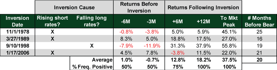
Exhibit 3: Historical Time From Inversion to Bear Market and Recession
Source: Global Financial Data, Inc. and Factset, as of 3/26/2019. *The yield curve came close to inverting, but flattened to 0.03% on 1/6/1960, 23 months prior to bear.
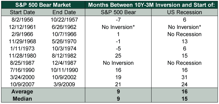
Exhibit 4: The Global Yield Curve Is Nicely Positive
Source: FactSet, as of 3/21/2019.
If you would like to contact the editors responsible for this article, please message MarketMinder directly.
*The content contained in this article represents only the opinions and viewpoints of the Fisher Investments editorial staff.
Get a weekly roundup of our market insights
Sign up for our weekly e-mail newsletter.

You Imagine Your Future. We Help You Get There.
Are you ready to start your journey to a better financial future?
Where Might the Market Go Next?
Confidently tackle the market’s ups and downs with independent research and analysis that tells you where we think stocks are headed—and why.
Related Resources
-
Market Analysis Pumping Up the Yen?2026-07-17
-
Expert Commentary This Week in Review | US-Iran Conflict, US Inflation, New UK Prime Minister
 2026-07-17
 -
Market Analysis Business Friendly Bureaucracy or No, Britain is Growing2026-07-16
-
Economics Don’t Doubt the Old World2026-07-16


Learn More
Learn why 210,000 clients trust us to manage their money and how Fisher Investments and its affiliates may be able to help you achieve your financial goals.
As of 6/30/2026
New to Fisher? Call Us.
Contact Us Today