


Personal Wealth Management / Economics
Something for Everyone in August US Inflation
Fed watchers’ inflation fixation remains rampant, but markets have moved on.

August US consumer price index (CPI) data hit the wires Friday, with the headline rate holding at 3.4% y/y.[i] Coming mere days before the Fed’s September 15 – 16 meeting, most coverage viewed it through that lens, with many convinced the inflation rate means a hike is now a near certainty—a factor many wrongly fear spells trouble for stocks. Let us review the data to help illustrate why we think a hike would be a mistake—but no disaster for markets.
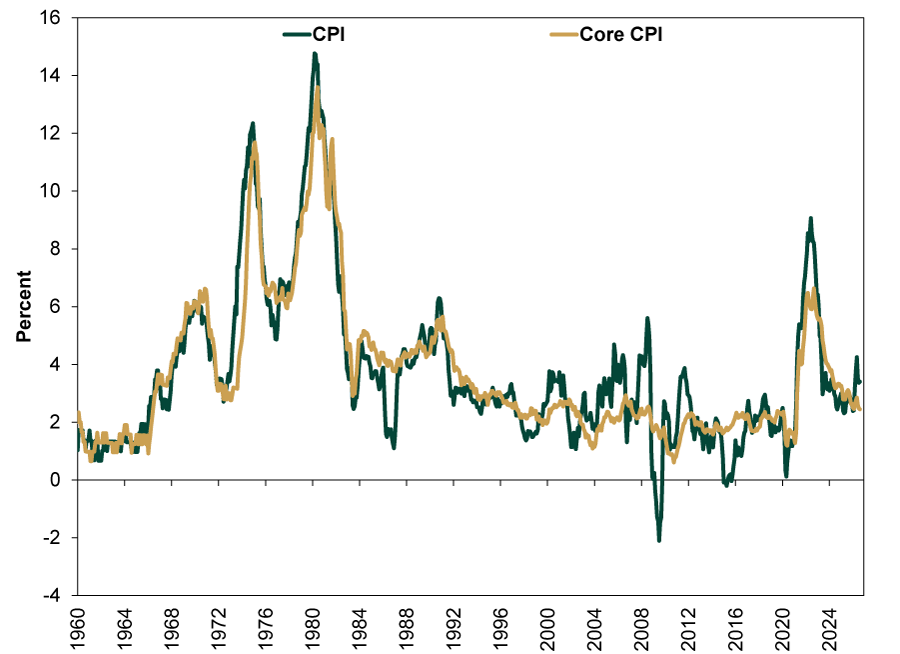
Elevated headline inflation was all about energy, as the CPI’s energy component rose 16.3% y/y with gasoline up 27.4% and fuel oil 52.0%.[ii] But outside energy, as Exhibit 1 shows, inflation continues trending lower with “core” (excluding food & energy) CPI sliding to 2.4% y/y, a five-year low. Now, August’s monthly headline CPI accelerated to 0.4% m/m from July’s 0.1%—again, led by energy—but that just underscores monthly oil price volatility amid ongoing Middle East conflict, not broad inflation trends. Monthly core inflation also ticked higher to 0.3% m/m from 0.2%, but this was mostly due to a one-off jump in wireless carriers’ pricing plans (which added 0.10 percentage point to core CPI), highlighting monthly volatility rather than widespread and rampant price increases.
Exhibit 1: Core Inflation Rate Slowing
Source: FactSet, as of 9/15/2026.
For broad inflation to take off, money supply growth would need to surge. As Nobel laureate Milton Friedman taught, inflation is always and everywhere a monetary phenomenon caused by too much money chasing too few goods and services. Broad US M4 money supply grew 7.9% y/y in July, far slower than June 2020’s 30.5% zenith. And, while that rate is slightly above the long-term average, broad money supply figures globally are growing far slower, suggesting the tinder for inflation is lacking.[iii]
But that doesn’t mean we know what the Fed will do—no one does. We see arguments going every which way, and the data could support almost any conclusion you like. Those advocating for hikes point to headline CPI’s energy-driven acceleration thinking (incorrectly, to us) that will spread to other categories. Others point to core CPI, noting the underlying trend’s ongoing deceleration when making the case for the Fed to hold. The split not only shows how folks’ interpretation of the same data can diverge, but Fed members’ too! For investors, none of this is telling except for helping gauge sentiment.
But notice a key missing piece in this debate: The Fed has little ability to control energy prices (or carriers’ wireless pricing plans for that matter). A rate hike would likely be quite ineffectual in that regard. Some even work politics into that, saying a hike would assert Fed independence (itself a political rationale). Or that the Fed shouldn’t hike this close to an election—also political. All the competing claims and interpretations add up to one central point: No one can know what the Fed will do. Speculation over what amounts to differences in opinion is pointless. Not that Fed decisions don’t matter, but we suggest waiting for policymakers to actually make one, as it is a mistake (and unnecessary) to guess what the Fed might do.
Meanwhile, you can assess various interest rate scenarios—and financial conditions—without needing to divine Fed intentions. While we think a hike would be an error, the scope of it would be pretty small today. Fed rate moves affect banks’ short-term funding costs, which can influence lending—and economic growth—by raising or lowering the spread between their funding costs and the rates they charge on new loans. While the Fed controls some short rates, the long-term rates banks lend at are market set. So even if the Fed hikes, banks still have plenty of incentive to keep credit flowing if long rates stay above short, as spreads remain positive.
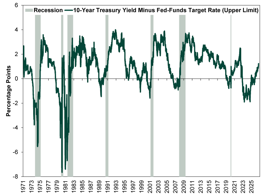
Exhibit 2 shows the yield curve—the difference between short and long rates, a proxy for banks’ new loan profitability—is the steepest in four years. A rate hike or three wouldn’t invert it. Bank lending, currently rising 7.3% y/y through September 2 and near its fastest clip in over three years, is likely to remain profitable for the foreseeable future even with a few hikes, fueling expansion.[iv]
Exhibit 2: Steep Yield Curve Cushions Against Fed Hikes
Source: FactSet, as of 9/15/2026. 10-Year Treasury yield minus fed-funds target rate (upper limit), 1/8/1971 – 9/14/2026.
Looking globally, the evidence rate hikes hobble economies and stocks right now is also slim. Central banks often demonstrate a remarkable degree of groupthink. We have already seen three Reserve Bank of Australia (RBA) quarter-point moves upward and the European Central Bank (ECB) follow suit with two. With long rates above short there—and globally—their economies are chugging along. And since the RBA started hiking rates in February, the ASX 200 (Australia’s benchmark equity index) is up 1.5% in Aussie dollars. From the ECB’s initial June move, eurozone stocks have risen 1.9% in euros.[v]
So as much as we think rate hikes are neither needed nor likely to prove effective, a Fed mistake (or three) wouldn’t be a calamity. While worth watching, it doesn’t require an immediate response.
[i] Source: BLS, as of 9/11/2026.
[ii] Source: BLS, as of 9/11/2026.
[iii] Source: Center for Financial Stability, as of 9/15/2026.
[iv] Source: Federal Reserve Bank of St. Louis, as of 9/15/2026.
[v] Source: FactSet, as of 9/15/2026. ASX 200 return with gross dividends, 2/3/2026 – 9/14/2026, and MSCI EMU return with net dividends, 6/11/2026 – 9/14/2026.
If you would like to contact the editors responsible for this article, please message MarketMinder directly.
*The content contained in this article represents only the opinions and viewpoints of the Fisher Investments editorial staff.
Get a weekly roundup of our market insights
Sign up for our weekly e-mail newsletter.

You Imagine Your Future. We Help You Get There.
Are you ready to start your journey to a better financial future?
Where Might the Market Go Next?
Confidently tackle the market’s ups and downs with independent research and analysis that tells you where we think stocks are headed—and why.
Related Resources
-
Weekly Wrap-Up Fisher Investments Reviews: Last Week in Markets — September 28 - October 22026-10-05
-
Market Analysis Budgeting for French Debt Fears2026-10-05
-
Expert Commentary This Week in Review | Q3 Recap, US Jobs, US-China Trade
 2026-10-02
 -
Market Analysis Reader Mailbag: September 20262026-09-30




Learn More
Learn why 210,000 clients trust us to manage their money and how Fisher Investments and its affiliates may be able to help you achieve your financial goals.
As of 9/30/2026
New to Fisher? Call Us.
Contact Us Today