Personal Wealth Management / Market Analysis
Chart(s) of the Day: More Perspective on ‘Flat Yield Curve’ Fears
For years, media have warned a flattening yield curve means trouble—are they right?

The flattening US yield curve has been all over headlines lately, which may make it seem like new news. But like other ghosts that have popped up during this bull market, flat yield curve worries have made appearances before, similarly warning economic trouble was brewing. Yet the US economic expansion has chugged along. In my view, these headlines share a timeless investing lesson: Past movement doesn’t determine the future.
Here is a chart of the 10-year US Treasury yield minus the effective fed-funds rate since this bull market began in 2009. The line falling closer to zero means the spread is narrowing—said differently, the yield curve is flattening.
Exhibit 1: The Yield Spread Since 2009
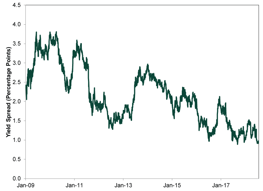
Source: St. Louis Federal Reserve, as of 7/20/2018. The yield curve spread is the 10-year Treasury yield minus the effective fed-funds rate, 1/2/2009 – 7/20/2018.
No doubt the spread has narrowed recently (read this for more perspective on the why). However, the yield curve’s flattening hasn’t been a smooth, consistent path. It has been pretty bouncy.[i] From the end of 2013 – early 2015, the spread seemed like it was on a steady course to Flatsville. Then what happened? It popped up for several months! A narrowing yield spread is no one-way ticket to an inverted yield curve.
Yet headlines couldn’t help themselves, warning trouble loomed at the first sign of flattening. Let us take a journey back in time and trace “flat yield curve” worries in recent years. Some yield curve discussion stirred occasionally in 2014 and 2015, which coincided with the end of QE and questions about when the Fed would start raising rates.
Exhibit 2: The Yield Spread, 2013 – 2015
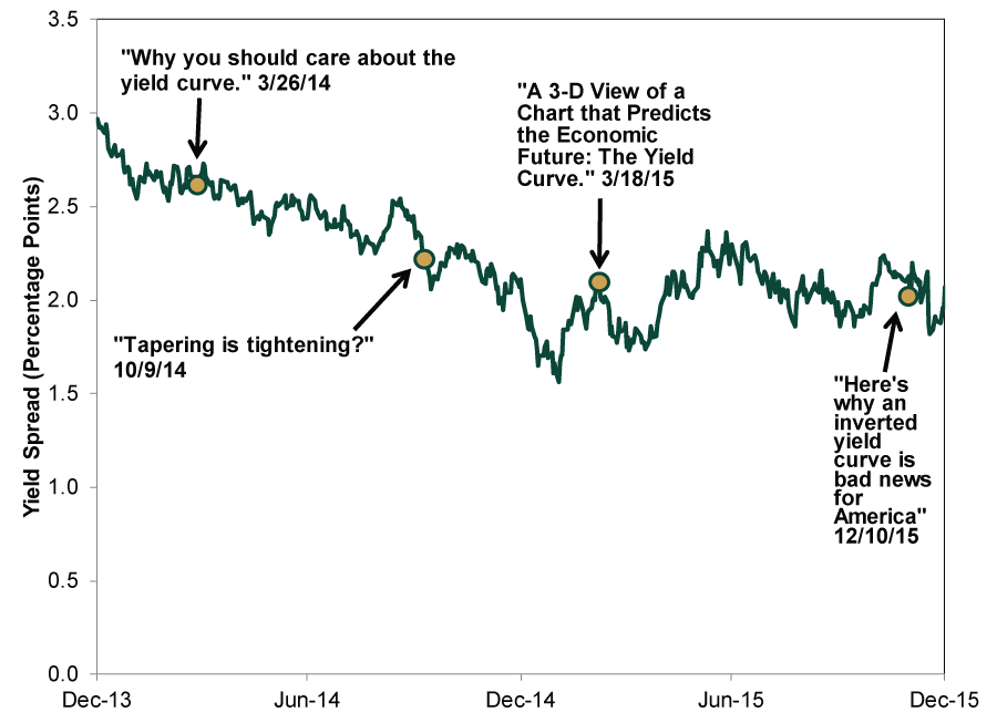
Source: St. Louis Federal Reserve, as of 7/20/2018. 12/31/2013 – 12/31/2015. Headlines from MarketWatch, Financial Times, The New York Times and Business Insider.
That chatter started picking up in 2016.
Exhibit 3: The Yield Spread, 2016
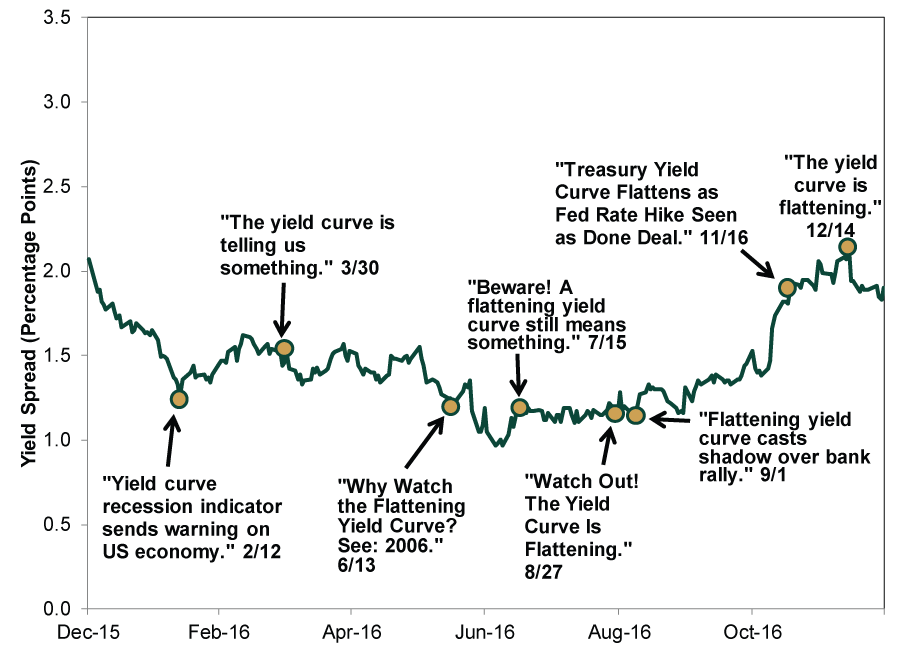
Source: St. Louis Federal Reserve, as of 7/20/2018. 12/31/2015 – 12/31/2016. Headlines from Financial Times, Business Insider, The Wall Street Journal, MarketWatch, Barron’s and Bloomberg.
It didn’t stop in 2017.
Exhibit 4: The Yield Spread, 2017
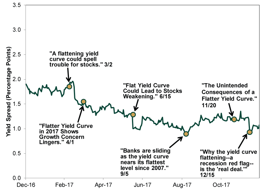
Source: St. Louis Federal Reserve, as of 7/20/2018. 12/31/2016 – 12/31/2017. Headlines from CNBC, The Wall Street Journal, Barron’s, Business Insider, Bloomberg and MarketWatch.
And it is seemingly hitting a crescendo today.
Exhibit 5: The Yield Spread, Year-to-Date

Source: St. Louis Federal Reserve, as of 7/20/2018. 12/31/2017 – 7/20/2018. Headlines from Financial Times, Reuters, Bloomberg, CNNMoney, The New York Times and Barron’s.
We don’t dismiss the yield spread’s power. We aren’t arguing it is sending mixed signals or that it isn’t telling anymore. However, the details matter. Flatter isn’t inverted—and the latter is the more telling sign that not all is well in credit markets (though this also doesn’t necessarily mean doom is imminent).
For more evidence nothing here is a timing tool, here is a look at the longest bull market in history, which ran through the 1990s.
Exhibit 6: The Yield Spread During the 1990s
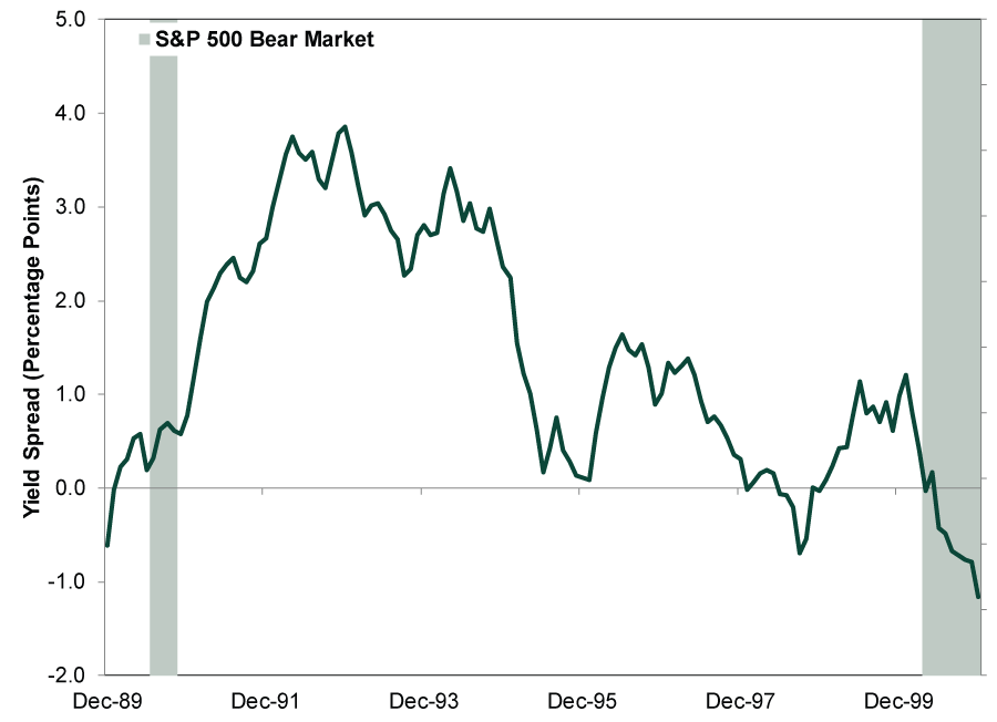
Source: St. Louis Federal Reserve, as of 8/1/2018. Monthly yield spread, December 1989 – December 2000. S&P 500 bear market dates are 7/16/1990 – 10/11/1990 and 3/24/2000 – 10/9/2002.
As we wrote recently, even a yield curve inversion doesn’t automatically lead to a recession or bear market. The Fed reacted correctly—it happens!—and lowered rates enough in the mid-1990s to extend the expansion and bull market for several more years. Nothing here is predestined, despite what headlines warn.
Watching the yield curve makes a lot of sense, but as with any other economic data, keep the numbers in perspective. Ask questions about what has happened before when similar developments occurred. Don’t extrapolate or react rashly. When considering this bigger picture, the US economy looks like it is on fine footing—an important underlying driver for the broader global bull market. Don’t let the media’s bombast spook you—trouble doesn’t appear imminent.
If you would like to contact the editors responsible for this article, please message MarketMinder directly.
*The content contained in this article represents only the opinions and viewpoints of the Fisher Investments editorial staff.
Get a weekly roundup of our market insights
Sign up for our weekly e-mail newsletter.

You Imagine Your Future. We Help You Get There.
Are you ready to start your journey to a better financial future?
Where Might the Market Go Next?
Confidently tackle the market’s ups and downs with independent research and analysis that tells you where we think stocks are headed—and why.
Related Resources
-
Politics Blunting Burnham?2026-07-21
-
Market Analysis Why the SOX “Bear Market” Isn’t Foreboding2026-07-21
-
Expert Commentary 3 Things You Need to Know This Week | Q2 Earnings, ECB Meeting, Trump Accounts
 2026-07-20
 -
Weekly Wrap-Up Fisher Investments Reviews: Last Week in Markets—July 13 - July 172026-07-20


Learn More
Learn why 210,000 clients trust us to manage their money and how Fisher Investments and its affiliates may be able to help you achieve your financial goals.
As of 6/30/2026
New to Fisher? Call Us.
Contact Us Today