Personal Wealth Management / Market Analysis
Chart(s) of the Day: 'Support' Has No Evidentiary Support
The S&P 500 crossed below its 200-day average Monday and back above it Tuesday. Neither of these developments is predictive.

As we perused the coverage of Monday’s volatility, we noticed a common observation: The S&P 500 crossed below its 200-day moving average, a popular technical indicator. As the thinking goes, during a bull market, the 200-day average is the “support” level. As long as the index stays above it, good times lie in store. And if it crosses below? The rally is allegedly losing momentum, so look out. While Tuesday’s 1.3% rise put the index back above that allegedly magical level, we still feel obliged to issue a public service announcement: The 200-day moving average has no predictive power.[i] Past returns do not predict the future, and there is a slew of false signals.
The following charts show the S&P 500 and its 200-day average during this and the prior two market cycles. As you will see, while the index did cross below the 200-day average near the start of the prior bear market, it also did so several times during each bull market. Even on those occasions when deeper corrections ensued, stocks rebounded quickly, with the corrections ending before the index crossed back above the 200-day line. Quite simply, this is a terrible timing tool.
As we’ve written before, using technical analysis alone amounts to driving while looking solely in the rearview mirror. No matter how hard you stare at what just happened, it won’t tell you what is to come. During corrections, sentiment swings can knock stocks for no good reason. Those wobbles aren’t predictive, and they are unrelated to the fundamental features stocks weigh over the longer term. But looking at a chart won’t tell you any of that. It will probably just hoodwink your brain into seeking patterns. To paraphrase a certain apocryphal Freudism: Sometimes a line is just a line. The 200-day moving average is just a line.
Exhibit 1: 1990s Bear and Bull
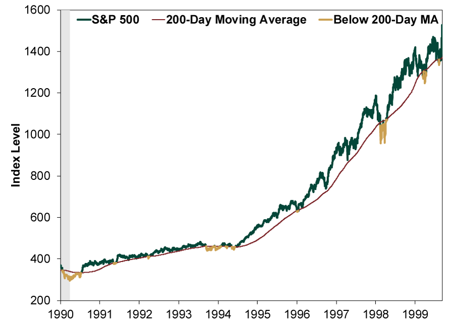
Source: FactSet, as of 4/3/2018. S&P 500 Price Index, 7/16/1990 – 3/24/2000. Shading indicates bear market.
Exhibit 2: 2000s Bear and Bull
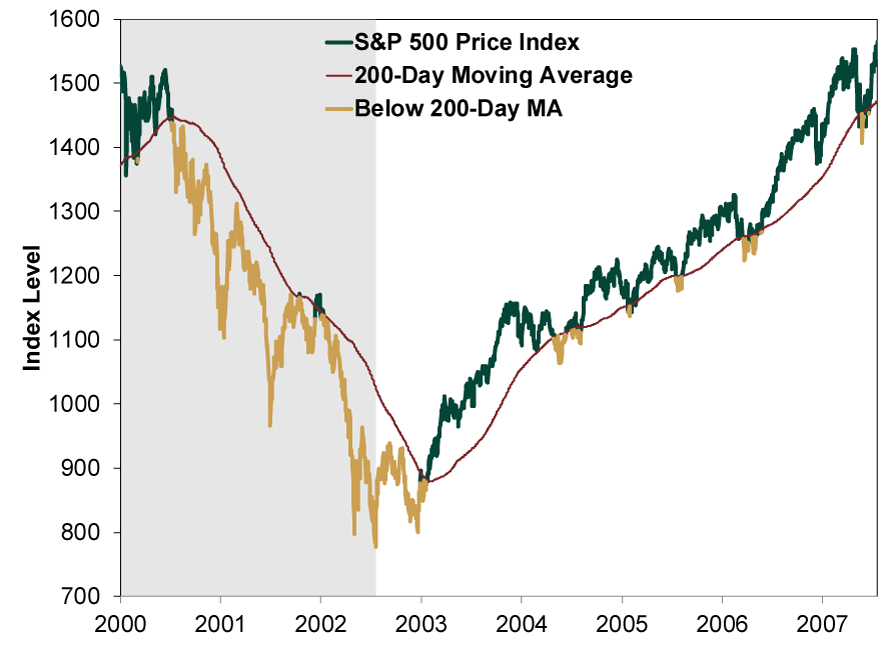
Source: FactSet, as of 4/3/2018. S&P 500 Price Index, 3/24/2000 – 10/9/2007. Shading indicates bear market.
Exhibit 3: The Last Bear and This Bull
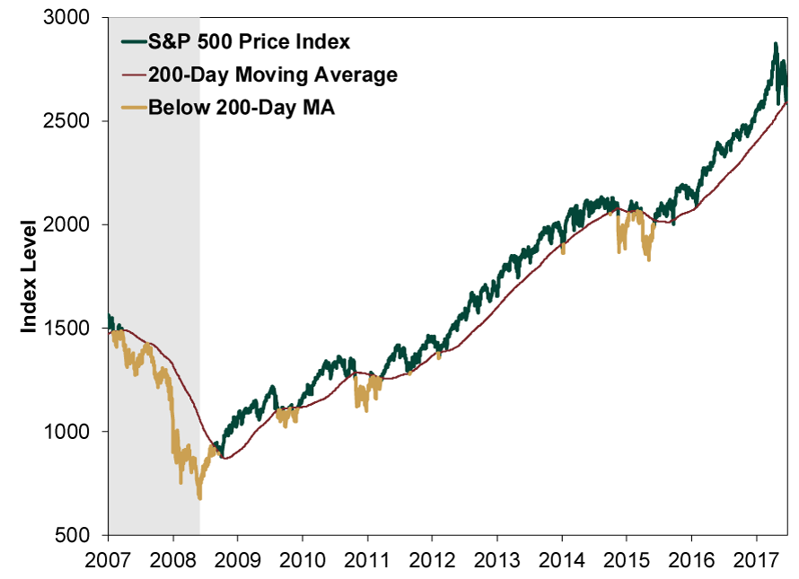
Source: FactSet, as of 4/3/2018. S&P 500 Price Index, 10/9/2007 – 4/2/2018. Shading indicates bear market.
[i] Source: FactSet, as of 4/3/2018. S&P 500 price return on 4/3/2018.
If you would like to contact the editors responsible for this article, please message MarketMinder directly.
*The content contained in this article represents only the opinions and viewpoints of the Fisher Investments editorial staff.
Get a weekly roundup of our market insights
Sign up for our weekly e-mail newsletter.

You Imagine Your Future. We Help You Get There.
Are you ready to start your journey to a better financial future?

Where Might the Market Go Next?
Confidently tackle the market’s ups and downs with independent research and analysis that tells you where we think stocks are headed—and why.
Related Resources
-
Expert Commentary This Week in Review | Q2 Market Recap, June US Jobs, Trade Deal Update
 2026-07-03
 -
Market Analysis Declaring Fed Independence Fears False2026-07-01
-
Market Analysis Why El Niño Doesn’t Necessitate Portfolio Shifts2026-07-01
-
Market Analysis Reader Mailbag: June 20262026-06-30


Learn More
Learn why 200,000 clients trust us to manage their money and how Fisher Investments and its affiliates may be able to help you achieve your financial goals.
As of 3/31/2026
New to Fisher? Call Us.
Contact Us Today