Personal Wealth Management / Market Analysis
See Through the Oily Haze Skewing Economic Data
Oil's big drop since 2014 seems to have clouded investors' view of the US economy.


Photo by Christopher Furlong/Getty Images.
Economic data are never a perfect reflection of growth, and their imperfections often twist investors' view of growth, affecting sentiment greatly. Hence why this website has frequently reminded[i] readers it is crucial to dig beneath headline data and analyze the moving parts. Yet all too often, investors overlook this step, an error that seems to be running amok today, roiling sentiment in the process. The culprit: Oil, and its influence on macroeconomic data. Ever since oil's big drop started in late 2014, fear that this stemmed from weak global demand rose, which many took as a sign of global economic weakness. However, I believe that if you strip out the skew caused by Energy, you will find an economy far healthier than many perceive. What's more, barring renewed deep weakness in oil prices, this skew is likely to gradually fall out of the data over the next few months and quarters, giving investors a clearer view of where the economy actually is.
A lot has been made in early 2016 about the above-average correlation between oil and stocks, with many fixating on every crude wiggle to try to divine stocks' likely trajectory. And it's true that oil and stocks have been more correlated than their long-term averages. The better question, though, is why? The relatively boring, but likely correct, answer is sentiment. Headlines are fixated on oil. Everyone, or at least every pundit, has an opinion or theory about oil's -75% decline since mid-June 2014 and what it means for the economy at large. Many suggest the decline shows the US economy is weak; that flagging demand across the economy signals a recession looms, with many pointing to a wide array of economic data as evidence. Yet, oddly,[ii] they rarely adjust for the obvious skew caused by Energy. Industrial production, earnings, retail sales, rail traffic, imports, inflation, you name it-headline statistics showing negative skew from a massive drop in one small economic sector are taken as gospel.
While it generates tons of headlines, Energy production is a small slice of America's huge economy. In value-added terms, oil and gas drilling amounted to 1.7% of US GDP in 2014.[iii] The broader mining industry it belongs to (including metals, coal and support activities) is 2.7% of GDP. (Exhibit 1) Oil and gas production employed 178,800 workers in February 2016-the broader mining and logging sector 734,000. That latter figure amounted to 0.5% of US nonfarm payrolls in February.[iv] That's why mining and logging employment fell by -170,000 (-21,100 in oil and gas extraction) from their 2014 highs to now while overall US payrolls grew steadily.[v] Energy isn't a huge piece of the US economy, and it is a slice that produces something that is a cost for other businesses and consumers.
Exhibit 1: The Mining Sector's Share of US GDP
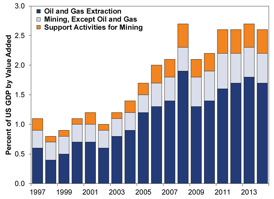
Source: US Bureau of Economic Analysis, as of 3/8/2016. 1997 - 2014.
So how does a small sector skew data? Well, there are a few ways. For one, many different gauges weight Energy much more heavily than its size in the broader economy. Take industrial production. Theories about weak industrial production abound, with some going so far as to claim the recent trend virtually ensures a recession has arrived. But unlike the broad US economy, the Fed's Industrial Production gauge is 24% energy-related-a big overweight relative to GDP. Conveniently, the Fed does publish two sub-indexes in every release-energy production and non-energy production. Yet these figures are virtually never cited in major media or blog coverage. As Exhibit 2 shows, the non-energy gauge-76% of industrial production-is rising.
Exhibit 2: Energy, Non-Energy and Total Industrial Production
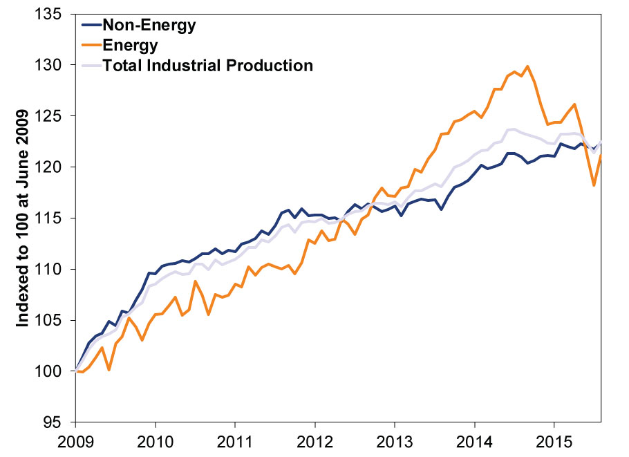
Source: Federal Reserve Bank of St. Louis, as of 3/4/2016. June 2009 - January 2016.
Another reason these data are skewed is simply the size and power of the whack the sector has taken. For example, take the frequently cited "bearish" stat that S&P 500 earnings fell -3.4% y/y in Q4 2015 and are down a couple quarters in a row-an earnings recession![vi] And, yes, that is what headline data show. But when you strip out Energy earnings' massive -76% y/y drop, earnings rose 2.9%.[vii] In full year 2015, headline earnings fell -1.1%. Excluding Energy, they grew a nice 6.2%.[viii] The National Bureau of Economic Research defines the word recession as, "a significant decline in economic activity spread across the economy." While they don't weigh in on the specific term "earnings recession," we'd suggest a decline you can reverse by removing one sector totaling less than 7% of S&P 500 market cap and 3% of GDP lacks that "spread across the economy component."
When oil initially fell, many pundits licked their chops at the prospects of higher consumer spending from the "tax cut" brought by cheaper energy. But, months in, many suggested it didn't materialize and were disappointed. But this theory always mistook how declining energy prices impact retail sales.[ix] Fact: The Census Bureau's retail sales data are a narrow gauge of consumer activity including gasoline station sales, and they aren't adjusted for price changes. So falling oil prices' impact at the pump will be a negative in the statistic. That is how the data are gathered, pure and simple. Since there is no corresponding rule dictating consumers must spend the savings, falling oil prices at least initially put downward pressure on this gauge. If you strip out gas station sales, it's fairly easy to see demand isn't faltering. (Exhibit 3)
Exhibit 3: Retail Sales and Retail Sales Ex. Gasoline
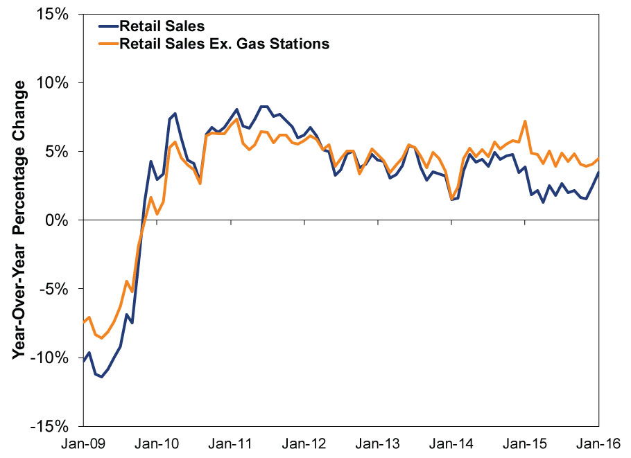
Source: US Census Bureau, as of 2/12/2016. January 2009 - January 2016.
Now, again, retail sales are a narrow gauge excluding most services spending, which is the majority of US consumption. Gas station sales were 7.3% of the index in January 2016, down from almost 12%. By contrast, energy goods (including gasoline) amounted to only 2.5% of the broader Personal Consumption Expenditures (PCE) GDP component in Q4. Real PCE's monthly rate has shown much less volatility coincident with falling oil prices-price adjustment and breadth make a huge difference. As a result, it would be hard to ever discern much impact from falling energy, to the extent you can even isolate it from the dozens of other moving parts in the series. That said, PCE rarely gets the attention of the advance retail sales report, which comes out much earlier.[x] Anxious investors latching onto the earlier data could be led astray.
Exhibit 4: Real Personal Consumption Expenditures
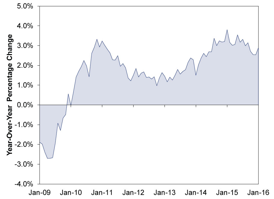
Source: US Bureau of Economic Analysis, as of 3/9/2016.
Bears also occasionally cite rail traffic, noting that total carloads are down and alleging transport metrics like this are reliable leading indicators of economic direction. It is true rail traffic isn't very robust at present. However, this is largely a secondary effect of the US energy production boom. Increased oil, and most particularly, natural gas output, is quashing coal. You can see this easily in Exhibit 5, which plots US electricity generation by source. With utility demand cratering, demand for coal is down. Coal carloads have historically averaged around 40% of US rail traffic, weighing on rail traffic overall. Excluding coal, train traffic is up 5.1% thus far in 2016.[xi] (Exhibit 6)
Exhibit 5: US Electricity Generation by Source
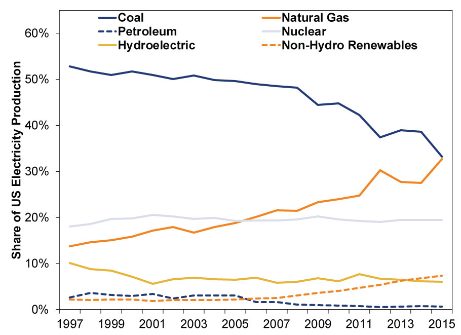
Source: US Energy Information Administration, as of 3/9/2016. 1997 - 2016. Renewables include wind, solar, wood biomass, waste biomass and geothermal.
Exhibit 6: Total US Train Carloads and Total Carloads Ex. Coal
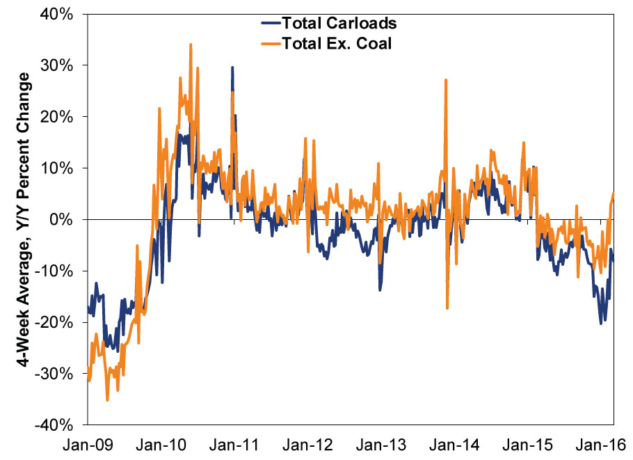
Source: American Association of Railroads, FactSet, as of 3/4/2016. 1/2/2009 - 3/4/2016.
When you consider the preceding data and charts, it's hard to draw the conclusion weak oil prices stem from faltering economy-wide demand. And there is precedent for oil prices to fall this much tied to supply growth-and not derail the economy.
In the mid-1980s, West Texas Intermediate crude oil prices fell -67%-a crash not dissimilar from 2014/2015. (Exhibit 7) The cause? The late 1970s' high prices led to increased exploration and production from sources like Alaska's North Slope, Mexico and the North Sea. OPEC's response (led by Saudi Arabia), much like today, was to keep production high, aiming to maintain market share. Here is a New York Times article from 1986 neatly documenting this -the similarities to today are striking. Big oil price declines driven by supply growth can and do happen amid expansions. Investors just don't seem to remember them very well.
Exhibit 7: Oil Crashes, 1986 and Now
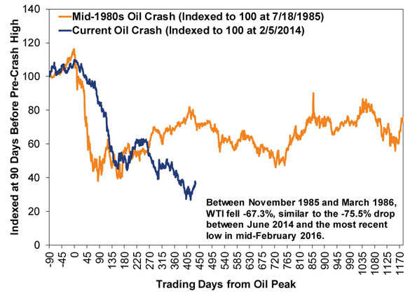
Source: FactSet, as of 3/8/2016. West Texas Intermediate crude oil, 7/18/1985 - 7/31/1990 and 2/5/2014 - 3/8/2016.
Now, from here, barring another big drop, the skew created by energy prices likely begins falling out of macroeconomic data, allowing investors to see the economy's actual health. While it could easily reverse given last spring's short-lived oil rally (which might temporarily distort the y/y benchmarks for inflation over the next few months), inflation exemplifies this. January's year-over-year headline US inflation gauges (both CPI and the PCE price index) nearly doubled December's rates due to a lower comparison base, as energy prices fell a lot between December 2014 and January 2015. Monthly inflation was basically unchanged. Yet many seemed to breathe a sigh of relief over the news inflation was trending towards the Fed's 2% y/y target rate and spent more time focusing on core inflation (excluding food and energy). The latter didn't materially diverge from its long-running, slow acceleration.
As their vision clears, investors will gain a better view of economic fundamentals-one less source of skepticism weighing on sentiment. Assuming some other, massive negative that doesn't seem to exist now doesn't arrive before that fog clears, investors will likely see a stronger economy than they presently appreciate.
[i] Admonished? Berated?
[ii] Or maybe not, if you know how media works.
[iii]Source: US Bureau of Economic Analysis. 2015 data will be released in late April, and I anticipate them showing Energy to be an even smaller slice of the economy. So this may be being a bit generous based on data availability.
[iv] Source: US Bureau of Labor Statistics.
[v] Ibid.
[vi] Source: FactSet Earnings Insight, as of 3/4/2016. 495 S&P 500 firms reporting.
[vii] Ibid.
[viii] Ibid.
[ix] And is a bad analogy.
[x] Source: US Bureau of Economic Analysis, as of 3/8/2016. I did not cite energy services in this calculation as it is a) not comparable to retail sales and b) because it is largely electricity and heating, which includes many non-oil-and-gas inputs and isn't directly benefitted or hurt by rising fuel costs.
[xi] Source: FactSet, as of 3/9/2016. Year-over-year change in the four-week moving average carloads ex. coal.
If you would like to contact the editors responsible for this article, please message MarketMinder directly.
*The content contained in this article represents only the opinions and viewpoints of the Fisher Investments editorial staff.
Get a weekly roundup of our market insights
Sign up for our weekly e-mail newsletter.

You Imagine Your Future. We Help You Get There.
Are you ready to start your journey to a better financial future?

Where Might the Market Go Next?
Confidently tackle the market’s ups and downs with independent research and analysis that tells you where we think stocks are headed—and why.
Related Resources
-
In The News In Orbit? On Tech Sentiment and IPOs2026-05-22
-
Market Analysis Global Bond Calamity Calls for Calm Perspective2026-05-22
-
Expert Commentary This Week in Review | UK Politics, Fed Developments, IPOs
 2026-05-22
 -
Market Analysis CPI Sheds Light on Britain’s Price ‘Cap’ Conundrum2026-05-20


Learn More
Learn why 200,000 clients trust us to manage their money and how Fisher Investments and its affiliates may be able to help you achieve your financial goals.
As of 3/31/2026
New to Fisher? Call Us.
Contact Us Today