Personal Wealth Management / Market Analysis
US Housing Update
Recent US housing data show how high prices alone don’t mean true asset bubbles.

US home prices are now well above pre-crisis highs, and concerns about affordability now stretch beyond the major coastal metropolises. Yet there is little to no chatter about a new housing bubble threatening to pop and derail stocks’ bull market—and for good reason. Despite elevated prices, today’s US housing market shows few similarities to the 2005 – 2007 period that preceded the big housing market downturn. As the following charts show, true bubbles require more than just sky-high prices—a timeless lesson for investors in all asset classes.
On the demand side, Exhibit 1 shows mortgage debt-servicing costs are currently at multi-decade lows due to the combination of low interest rates and low levels of mortgage lending over the past decade. By comparison, mortgage-servicing costs were at multi-decade highs prior to the housing bust, making it much more difficult for many households to continue meeting payment obligations.
Exhibit 1: US Mortgage Debt Service Costs Are Low
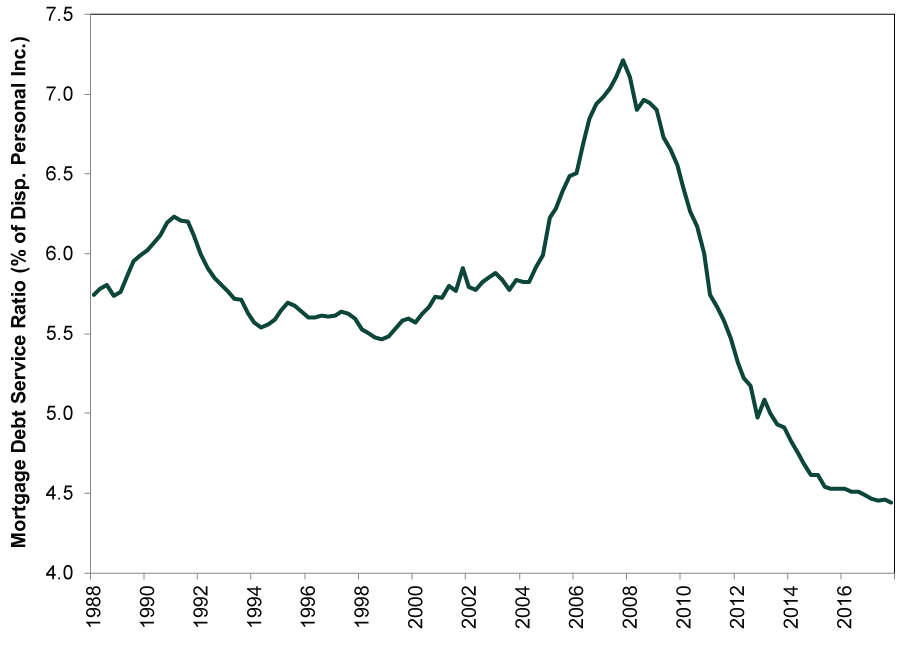
Source: Federal Reserve, as of 6/26/2018. Mortgage debt service costs as a percentage of disposable personal income, Q1 1988 – Q4 2017.
As a result, Exhibit 2 shows the delinquency rates for real estate loans held by large US banks continue to decline. By comparison, delinquency rates were on the rise as the US housing market turned in 2007.
Exhibit 2: Delinquency Rates for US Real Estate Loans Continue to Decline
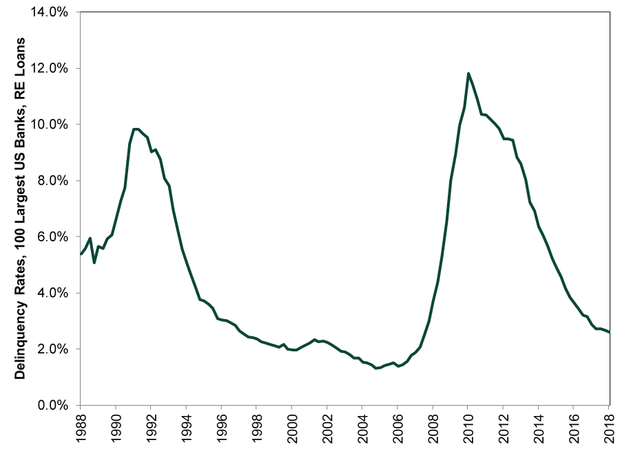
Source: Federal Reserve, as of 6/26/2018. Delinquency rates for real estate loans, 100 largest US banks, Q1 1988 – Q1 2018.
Part of the reason the housing market began deteriorating in 2006 – 2007 is the yield curve inverted, as shown in Exhibit 3 (using the spread between the 10-year and 3-month US Treasury yields). Banks profit by borrowing at short rates and lending at long rates, so when the yield curve inverts (when short rates are higher than long rates), banks often curtail lending. Today, the yield curve remains modestly steep.
Exhibit 3: US Treasury Yield Curve Is Modestly Steep
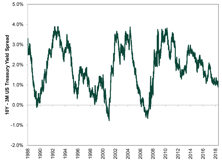
Source: FactSet, as of 6/26/2018. 10-year minus 3-month treasury yield, 1/1/1988 – 6/25/2018.
Exhibit 4 shows US banks’ willingness to lend to mortgage borrowers, as measured by the Fed’s quarterly Senior Loan Officer Opinion Survey. 2007’s sharp tightening of mortgage standards followed 2006’s yield curve inversion. Today, as the yield curve remains modestly steep, banks continue to ease standards for mortgage loans.
Exhibit 4: Banks Continue Easing Mortgage Standards
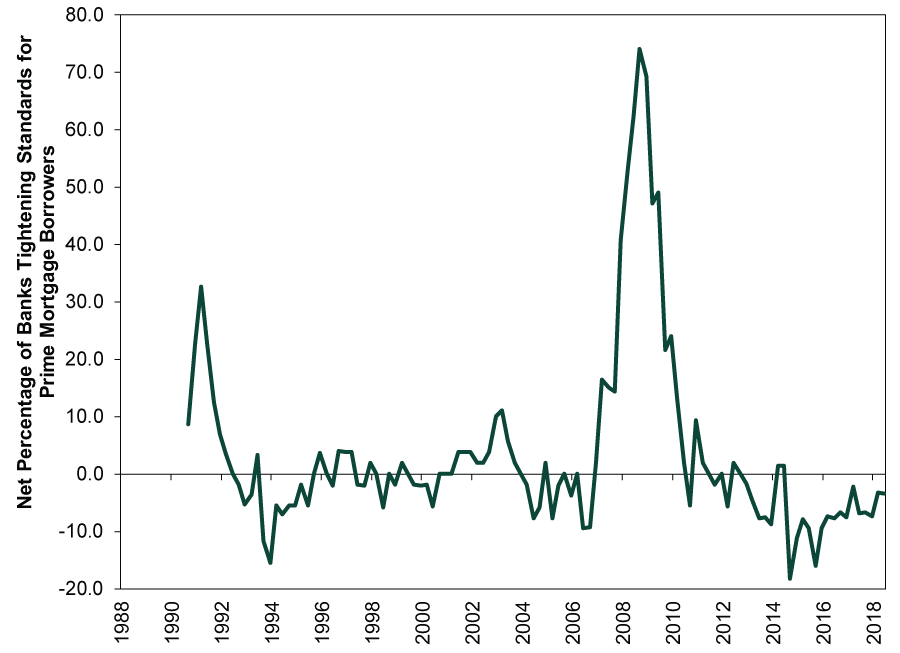
Source: Federal Reserve, as of 6/26/2018. Net percentage of banks tightening standards for prime mortgage borrowers, Q2 1990 – Q2 2018.
Meanwhile, supply remains modestly tight. As Exhibit 5, shows the US construction industry added over 2 million new units per year prior to the downturn. Today, supply growth is much more limited, with builders starting only 1.3 million new units per year. In many areas, home supply growth has fallen well behind population growth.
Exhibit 5: New US Construction Remains Modest
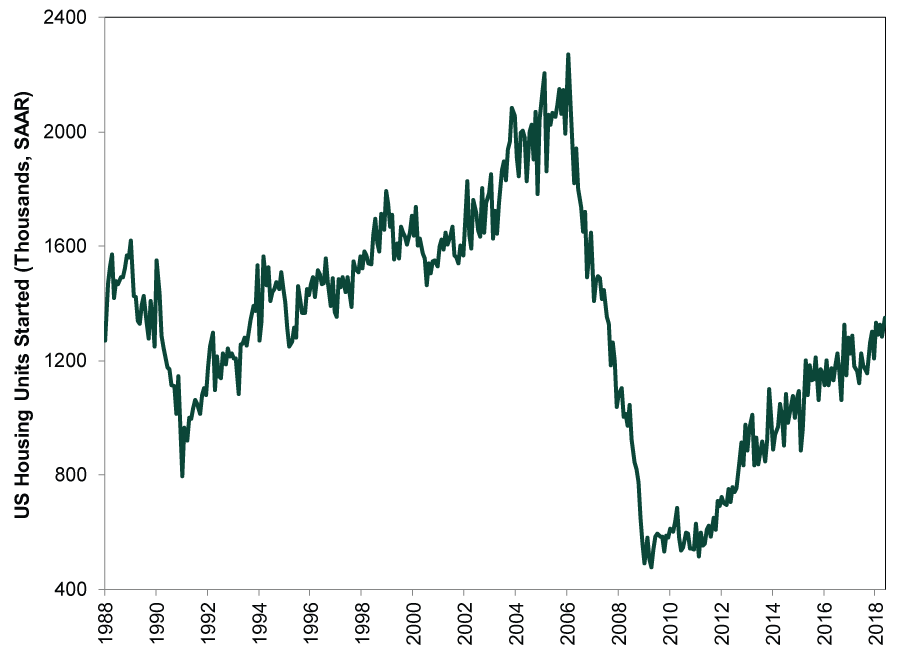
Source: US Census Bureau, as of 6/26/2018. Monthly housing starts, January 1988 – May 2018.
Not only is new supply growth limited, but as Exhibit 6 shows, the outstanding inventory of existing single family homes for sale remains at multi-decade lows. This is the opposite of where inventory stood when the housing market deteriorated in 2007.
Exhibit 6: Outstanding Supply for Sale Is Low
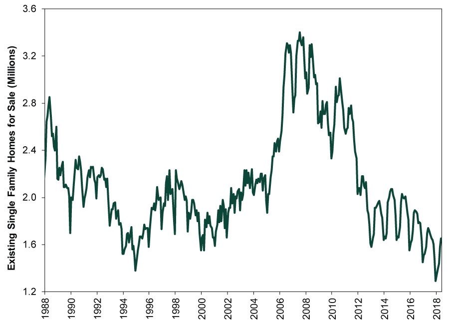
Source: National Association of Realtors, as of 6/26/2018. Existing single family homes for sale, January 1980 – May 2018.
Finally, Exhibit 7 shows the mid-2000s witnessed nearly 50% year-over-year gains in home prices in several cities (Phoenix and Las Vegas), perhaps evidence of pockets of euphoria. Today, home prices are rising, but the strongest major city year-over-year percentage gains are Seattle’s—in the low-teens. Mid-2000s levels of euphoria or risk-taking aren’t apparent.
Exhibit 7: Annual Home Price Growth Remains Well Below Mid-2000 Levels
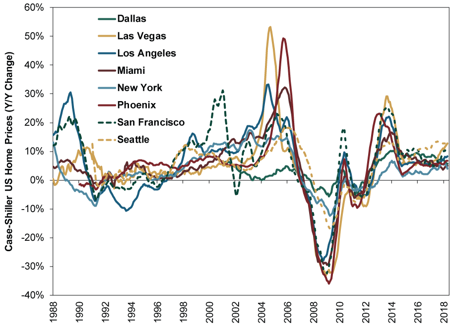
Source: S&P Case-Shiller, as of 6/26/2018. Year-over-year percentage changes in home prices for Dallas, Las Vegas, Los Angeles, Miami, New York, Phoenix, San Francisco and Seattle, January 1988 – April 2018.
Overall, we believe the US housing market is in fine shape. Demand appears healthy, supported by a modestly steep yield curve, while supply growth and sentiment remain restrained. Though this cocktail is frustrating for would-be homebuyers—particularly first-time buyers—media is quite right not to call it a bubble.
If you would like to contact the editors responsible for this article, please message MarketMinder directly.
*The content contained in this article represents only the opinions and viewpoints of the Fisher Investments editorial staff.
Get a weekly roundup of our market insights
Sign up for our weekly e-mail newsletter.

You Imagine Your Future. We Help You Get There.
Are you ready to start your journey to a better financial future?

Where Might the Market Go Next?
Confidently tackle the market’s ups and downs with independent research and analysis that tells you where we think stocks are headed—and why.
Related Resources
-
Expert Commentary This Week in Review | Iran Conflict Volatility, March PMIs, Gold’s Recent Sell-Off
 2026-03-27
 -
Market Analysis Will Lower Capital Requirements Send Banks Higher?2026-03-26
-
Politics This Week in Gridlock: Europe Edition2026-03-26
-
Expert Commentary Ken Fisher on Measuring Inflation, Currency Reset, Commodities, and more2026-03-25


Learn More
Learn why 195,000 clients trust us to manage their money and how Fisher Investments and its affiliates may be able to help you achieve your financial goals.
As of 12/31/2025
New to Fisher? Call Us.
Contact Us Today