Personal Wealth Management / Market Analysis
Going Against the Flow?
Does it matter that stock ownership, by one measure, was at near-record lows 18 months ago?

As financial news days go, Monday was about as slow as it gets: Sausage maker gets bought! Big stock split announced ages ago takes place! These days can be a drag, but this time, the slow newswire left room for stories that might otherwise go unnoticed—like a new study on changes in global stock ownership since 1959, which showed individual and institutional investors’ stock holdings are near a 50-year low relative to total investable assets. The media’s take, predictably, is rather split. Some say it’s bullish—that cash on the sidelines is future demand! Others are more dour, warning of a structuralfall in demand. In our view, though, neither interpretation passes—this isn’t bullish or bearish, and it says nothing about where stocks will go from here.
According to the study, investors globally had about $90.6 trillion in investable assets at the end of 2012. Of these, only 37.7% were invested in stocks, way under the long-term average of 52%. Both mainstream interpretations assume this reflects investor behavior—whether it’s still-skittish investors spooked after 2008 shunning stocks or Baby Boomers getting more “conservative.”
This is a flawed assumption: Ownership trends reveal almost nothing about investor behavior. They’re heavily skewed by market performance—not just in stocks, but in bonds, real estate, commodities and even the low returns of cash. The study’s authors didn’t publish their dataset, but looking at US holdings only illustrates the point. At year-end 2012—the same as the study’s cut-off—US households and non-financial corporations held 35.5% of their total financial assets in individual stocks. By the end of Q1 2014, that was up to 41.5%. The actual amount held in stocks rose from $26.5 trillion to $34.7 trillion, a 30.8% increase. We have a hunch that had far more to do with the 30.2% rise in global stocks over the same period than some radical shift in investor sentiment.
We can’t know for sure, though—in addition to being skewed by market returns, the data here are woefully suspect. The numbers above all come from the Fed’s Flow of Funds report, which doesn’t give the cleanest breakdown. It separates stock and mutual fund holdings—rightly—but doesn’t (and probably can’t) differentiate between stock and bond funds. The Investment Company Institute keeps tabs on stock and mutual fund flows, but these don’t include ETFs, which have gobbled up more and more assets over the years. The aptly named ETF.com does track ETF flows, but the data begin in 2010—too recent to discern meaningful long-term trends, and these data don’t differentiate between institutional owners and households, foreign and domestic.
So we’re left with individual stock holdings only as a proxy for US investors’ total equity exposure—not the most complete dataset, but at least a long and transparent one. Take it back to Q4 1951—the earliest available quarterly data—and it’s abundantly clear the data say more about market movement than investor preference. Exhibit 1 shows the US household and private sectors’ corporate equity holdings as a percentage of total financial assets and the S&P 500 Price Index Level on a logarithmic scale. The shorter-term trends in ownership—up or down—correspond directionally with market trends.
Exhibit 1: US Equity Ownership and S&P 500
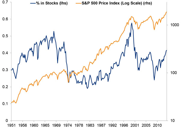
Source: FactSet, US Federal Reserve, as of 6/9/2014. Total US Household Sector and Nonfarm Nonfinancial Corporate Businesses’ total equity holdings as a percentage of total financial assets, S&P 500 Price Index Level, 12/31/1951-3/31/2014. The big drop-off in ownership after the tech bubble illustrates the impact of omitting funds from this analysis. It bugs us so much, we almost didn’t include this chart, but the directionality is still telling.
Would ownership, like stocks, be at an all-time high if equity mutual funds and ETFs were included here? No way to know—there are just too many other variables, like the long-term and recent returns of every other investable asset on the planet. Bonds have had a reasonably good run in recent years, and real estate is coming back.
If you need more proof investors’ percentage weighting in any one asset isn’t telling, though, look no further than cash. Exhibit 2 shows individual investors’ cash holdings at an absolute level and as a percentage of total financial assets (we excluded corporations, since they usually hold cash for different reasons than the rest of us). US households had an all-time high $9.5 trillion in cash when Q1 ended. But as a percentage of total assets, cash holdings were at a relative low.
Exhibit 2: US Households’ Cash Holdings
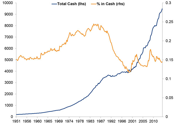
FactSet, US Federal Reserve, as of 6/9/2014. Total US Household Sector total cash holdings, absolute level and as a percentage of total financial assets, 12/31/1951-3/31/2014.
Yes, cash is both at an all-time high and a cyclical low. Need we say more?
As far as where stocks go from here, none of this information tells you. Not only does it fail to tell you whether the “dry powder” side or the “Boomer bust” side is right about future stock buying, but none of that even matters! Both arguments are just philosophically wrong. Whether it’s the retiring Boomers, frustrated Gen-Xers or allegedly stock-avoiding Millennials, long-term demographic shifts aren’t market drivers. One, there is no evidence they impact demand. Two, even if they did, they’re widely previewed and play out gradually over decades—by the time the first Boomers turned 65 on January 1, 2011, Boomer doom-mongering was over 10 years old. Not exactly the sort of surprise that moves markets. As for the bullish take, as we explained in far more detail here, the number of supposedly new buyers doesn’t matter—all that matters is how much investors overall are willing to pay for stocks. Current owners could just trade among themselves and drive the market higher. Neither bulls nor bears even attempt to account for shifts in equity supply over that span, either. Which seems a wee bit relevant to a meaningful analysis.
Demand isn’t the number of buyers. To assume these are equivalent is to assume the stock market is a huge shelf. Too few buyers, stocks pile up, prices fall. Lots of buyers, stocks fly off the shelves, prices rise. Not true! The market is an auction, with millions of bidders and offerings at any one time. Demand is simply those bidders’ willingness to pay more (or less) for whatever stocks are up for sale.
Equity ownership levels don’t say one iota about that willingness. They’re just an interesting, largely meaningless observation.
If you would like to contact the editors responsible for this article, please message MarketMinder directly.
*The content contained in this article represents only the opinions and viewpoints of the Fisher Investments editorial staff.
Get a weekly roundup of our market insights
Sign up for our weekly e-mail newsletter.

You Imagine Your Future. We Help You Get There.
Are you ready to start your journey to a better financial future?
Where Might the Market Go Next?
Confidently tackle the market’s ups and downs with independent research and analysis that tells you where we think stocks are headed—and why.
Related Resources
-
Market Insights Ken Fisher on Inflation, Sell America, US National Debt and More - June 20262026-06-01
-
Expert Commentary 3 Things You Need to Know This Week | Global PMIs, US Jobs, Estate Planning
 2026-06-01
 -
Weekly Wrap-Up Fisher Investments Reviews: Last Week in Markets—May 25 - May 292026-06-01
-
Market Analysis Big Gas Price Jump, Still a Small Spend2026-05-29


Learn More
Learn why 200,000 clients trust us to manage their money and how Fisher Investments and its affiliates may be able to help you achieve your financial goals.
As of 3/31/2026
New to Fisher? Call Us.
Contact Us Today