Personal Wealth Management / Politics
The War on Long-Term Forecasts (Not Coal)
What does President Obama's new environmental plan mean for investors?

Depending on your point of view, the Obama Administration did one of the following Monday:
- a) Announced a plan to reduce greenhouse gas emissions by 30% by 2030, creating jobs and improving public health
- b) Announced a plan to reduce greenhouse gas emissions by 30% by 2030, destroying jobs and hurting the economy
- c) Declared war on coal
- d) Released a 645-page document full of fuzzy math and arbitrary goals that probably doesn't mean much at all in the very long term-and certainly doesn't mean anything for stocks over the next 12 to 18 months
Count us in Camp "D." For all the hype accompanying Monday's announcement, it has little use for investors. Analyses touting its alleged benefits and warning of its dire costs are equally flawed-long-term forecasts based on arbitrary assumptions that can't account for all that will change between now and 2030. The plan itself suffers the same flaw and, for good (bad?) measure, ignores a very important counterfactual: Energy markets are well on their way to the proposed targets already. For investors, this is mostly a lesson in the follies of taking long-term reports-whether from the government or private sector-at face value. They're interesting from an academic standpoint, but they shouldn't impact investment decisions.
The trouble starts with the plan's actual target: Carbon emissions from electricity generation 30% below 2005 levels by 2030, predominantly through a reduction in coal-fired power plants. That isn't a typo: This is 2014, but they're using 2005 as the baseline. Which compels us to point a few things out. One: Total emissions (which include sulfur dioxide and nitrogen oxides as well as carbon dioxide) are already more than 15% under 2005 levels (Exhibit 1). Two: The amount of electricity generated by coal-fired power plants has dropped from 49.6% in 2005 to 39.1% in 2013 (Exhibit 2). Three: 180 coal-fired plants scheduled to retire between 2013 and 2017 aren't presently scheduled to be replaced (Exhibit 3). Four: Of the 295.22 gigawatts scheduled to be added to the grid between now and 2040, only 3.65 gigawatts come from coal (Exhibit 4). Seems to us this plan is mostly window-dressing.
Exhibit 1: Annual Emissions, 1990-2012
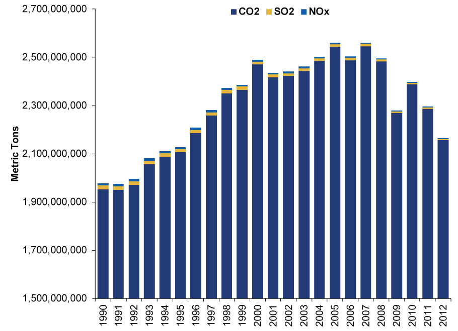
Source: Energy Information Administration, as of 6/2/2014.
Exhibit 2: Percentage of Annual Electricity Generation by Source, 1949-2013
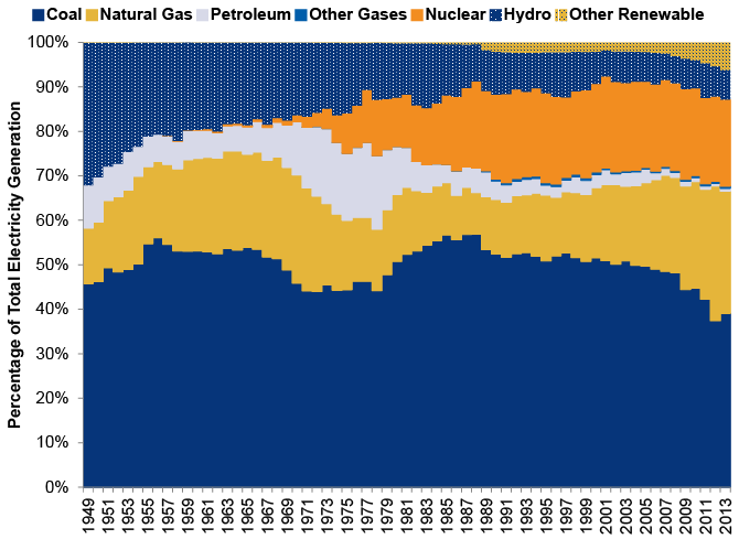
Source: Energy Information Administration, as of 6/2/2014. "Other Renewables" includes geothermal, waste, solar, wind and wood. Yes, wood-one of the dirtiest energy sources around-is technically renewable. And therefore green?
Exhibit 3: Planned Generating Capacity Changes, by Energy Source, 2013-2017
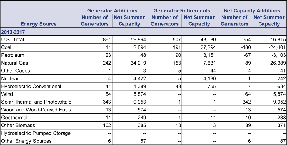
Source: Energy Information Administration, as of 6/2/2014. Plans are as of 12/31/2012. They've probably changed since then, but these things aren't released immediately.
Exhibit 4: Planned Electricity Generation Additions through 2040
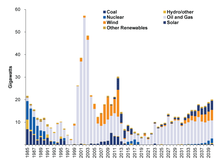
Source: Energy Information Administration, as of 6/2/2014. 1985-2011 shows actual additions. 2012-2040 displays long-term plans, which come with all the usual caveats about being subject to change.
The "why" behind the previous four charts, of course, is the shale boom. In 2005, Energy firms weren't combining the decades-old technologies of hydraulic fracturing and horizontal drilling to extract mass amounts of oil and natural gas from US shale formations. That September, natural gas production was the lowest in 17 years. Prices were at an all-time high of $14.84 per million BTU. Coal was cheap and plentiful, so coal was everywhere. Four years later, shale was in full swing, natural gas production was booming, and coal was the pricier alternative. These simple economics are largely what drove the changes in electricity generation in recent years-and what are behind many of the planned changes. The only "war" on coal is the one natural gas is waging.
The shale boom, in our view, largely upends both of the mainstream long-term forecasts about the proposal's long-term impact. The EPA says it'll bring up to $82 billion in net benefits by 2030, reduce electric bills by 8% and create "tens of thousands" of new jobs. The Chamber of Commerce foresees a $51 billion annual hit to GDP over the same period, 224,000 fewer jobs created annually, a $289 billion increase in electricity costs and a $586 billion hit to disposable income. Both assume the EPA's proposal somehow speeds up the pace of carbon reductions and coal replacement-but it doesn't! It slows things down! As Exhibit 5 shows, at the current pace of emissions reduction, we'd be at the President's target by 2019-an arbitrary fun factoid that illustrates the power of markets and the fecklessness of this mandate.
Exhibit 5: Hypothetical Extrapolation of Recent Emissions Reductions and EPA Target
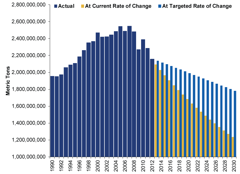
Source: Energy Information Administration and EPA, as of 6/2/2014. Data through 2012 show actual carbon emissions. The lighter blue bars from 2013 to 2030 show a straight-line path to the EPA's 2030 target. The yellow bars extrapolate the average annual percentage reduction in emissions from the 2007 peak through 2012 all the way to 2030. We don't mean to go all straight-line, long-term, CBO-style forecast on you, and we aren't saying this will happen-it probably won't! It merely illustrates how arbitrary this all is.
Here, rational minds would ask, doesn't the administration know how far emissions have already fallen? Our guess is they do, considering the information here all comes from government agencies. But we suspect there are some political considerations at work. For one, "war on coal" rhetoric is popular in coal-mining states, many of which have congressional seats and governorships up for grabs in November-and many of those states are traditionally Republican states with Democratic incumbents. As some have pointed out, Monday's proposal gives these incumbents the chance to distance themselves from the administration (which has lost popularity in recent months) and score a few brownie points. It's campaign fodder wrapped in shiny paper, hand-delivered from the White House. Second, by giving the industry 16 years to meet targets they're already halfway to, the administration gets to tout the "flexibility" in its plan, pacifying coal and those who fret any potential negative impact.
But that's all just guesswork-regardless of any potential impact in November, it likely doesn't move the needle enough toward Red or Blue to give either side a big majority in both houses. We probably still get (bullish) gridlock. Other than that, nothing here has any implications for stocks over the foreseeable future. The plan might create winners and losers over the very long term, but that's out of markets' forecasting time horizon-stocks generally look hardest at the next 12 to 18 months. During that window, the shale boom probably continues, coal producers probably continue seeking new markets abroad to shore up profits, and stocks keep paying attention to the many other drivers propelling this bull market.
If you would like to contact the editors responsible for this article, please message MarketMinder directly.
*The content contained in this article represents only the opinions and viewpoints of the Fisher Investments editorial staff.
Get a weekly roundup of our market insights
Sign up for our weekly e-mail newsletter.

You Imagine Your Future. We Help You Get There.
Are you ready to start your journey to a better financial future?

Where Might the Market Go Next?
Confidently tackle the market’s ups and downs with independent research and analysis that tells you where we think stocks are headed—and why.
Related Resources
-
Expert Commentary US Inflation, Fed Minutes, Consumer Sentiment | 3 Things You Need to Know This Week
 2026-04-06
 -
Weekly Wrap-Up Fisher Investments Reviews: Last Week in Markets—March 30 - April 32026-04-06
-
Expert Commentary This Week in Review | Q1 Recap, Earnings Guidance, Elections
 2026-04-03
 -
Market Analysis A Forward-Looking Lesson One Year After Liberation Day2026-04-02


Learn More
Learn why 200,000 clients trust us to manage their money and how Fisher Investments and its affiliates may be able to help you achieve your financial goals.
As of 3/31/2026
New to Fisher? Call Us.
Contact Us Today